Digital Productivity, Online planners, Planners
At a Glance Weekly Monthly Planner: Product Guide
Mar
Okay so I’ve been using the At a Glance Weekly Monthly planner for like three months now and honestly? It’s become my go-to recommendation but with some serious caveats depending on what you’re actually trying to do with it.
The Basic Layout Thing
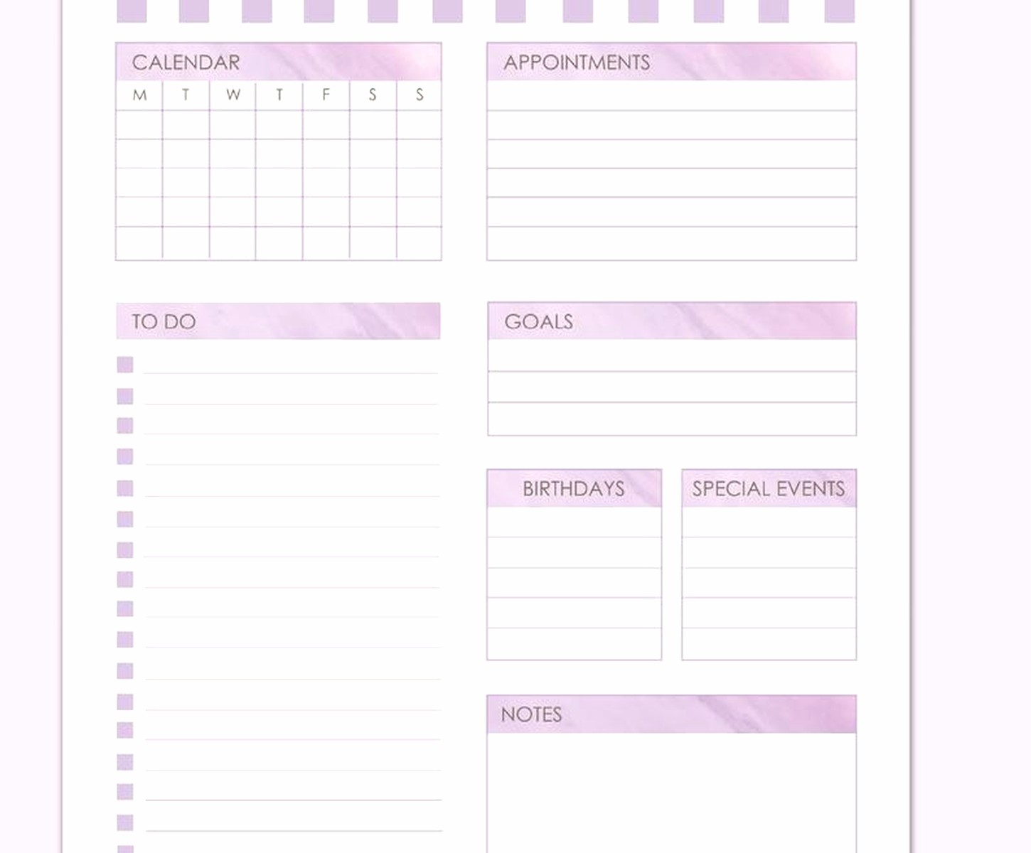
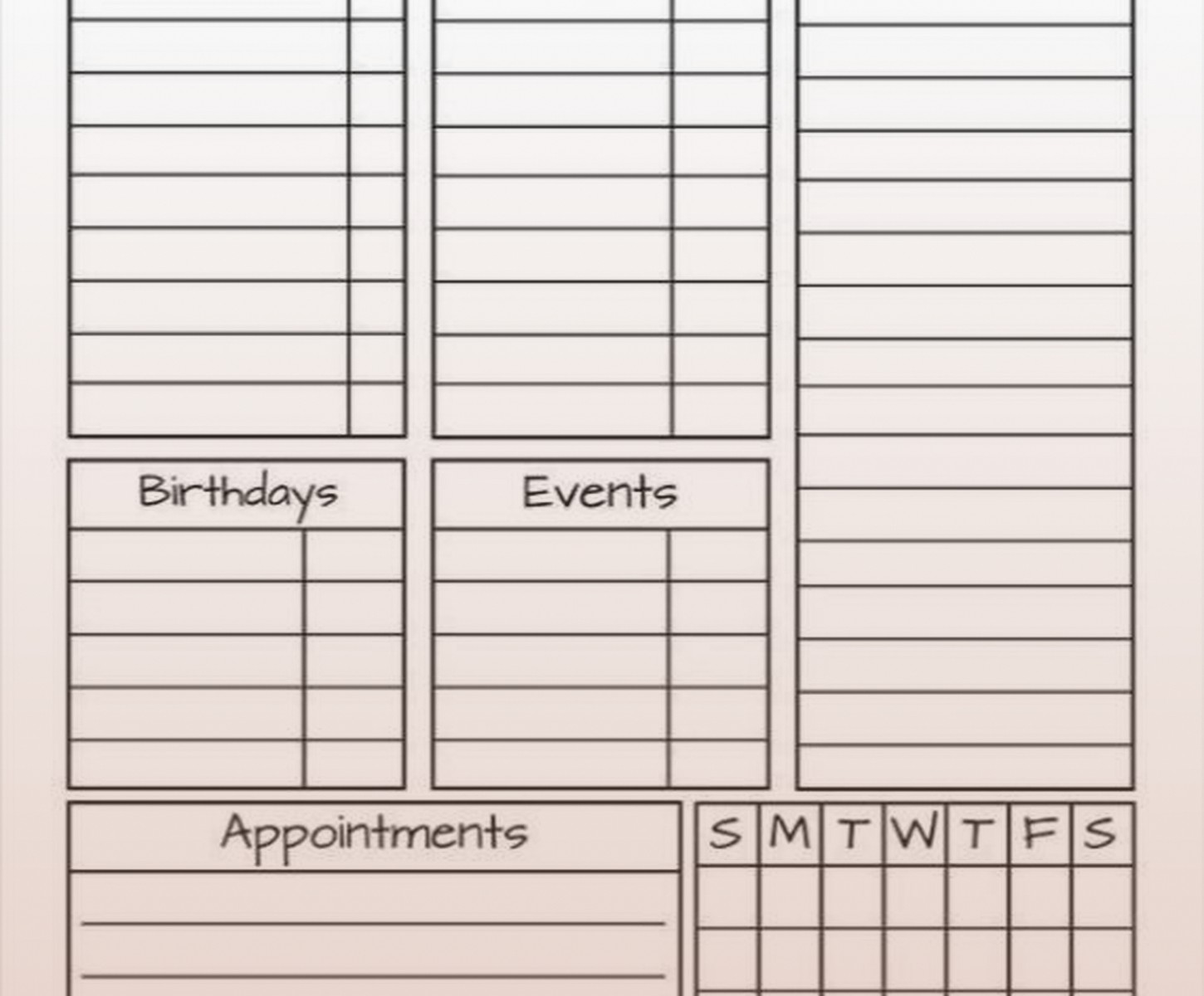
The weekly spreads are on the left side, monthly on the right, which sounds backwards but it’s actually kinda genius once you get used to it. Each week gets a full page with Monday through Sunday in columns, and the monthly calendar sits on the facing page so you can see both at once. I was skeptical at first because I’m used to weekly planners that give you like, tons of space for each day, but this forces you to be concise and honestly that’s been helpful for me.
The monthly pages have those little squares that are just big enough to jot down appointments but not big enough to plan your entire life in. Which is the point I think? You’re supposed to use the weekly for details and the monthly for overview stuff.
Size Options and Why They Matter More Than You’d Think
So they make this planner in like four different sizes and this is where people mess up. The standard desk size is 8.5 x 11 inches and it’s honestly too big if you’re planning to carry it around. I made that mistake initially because I thought bigger = more writing space = better, but then it just sat on my desk and I never referenced it when I was actually out doing things.
The compact size (about 5.5 x 8.5) fits in most bags and that’s what I switched to. There’s also a pocket version but the writing space gets so cramped that unless you have tiny handwriting or just need something for basic appointments it’s gonna frustrate you.
Oh and there’s a premium version that’s slightly larger than compact but has better paper quality. The regular paper is fine but if you’re using gel pens or anything with wet ink it can bleed through a bit. Not terrible but noticeable.
The Binding Situation
They offer both spiral bound and perfect bound versions. The spiral is way more practical if you actually write in this thing regularly because it lays flat. The perfect bound looks nicer on a desk and feels more professional but you’re gonna be fighting with it to stay open, especially in the first few months.
I started with perfect bound because it looked sleeker for client meetings but then I’d be holding the pages down with my coffee mug and it was just… anyway I switched to spiral and it’s so much better for actual daily use.
Wait I Should Mention the Cover Options
The covers range from basic black to these floral patterns to motivational quotes (skip those unless that’s really your vibe). The professional looking ones are black, navy, or gray. I’ve got the navy one currently and it’s held up well to being tossed in bags, though the corners are starting to show wear after three months of heavy use.
There’s also hardcover versus flexible cover. Hardcover is sturdier but adds weight and bulk. Flexible is better for portability but can get bent if you’re not careful. My cat knocked my flexible cover one off the counter last month and now there’s a permanent crease which is annoying but doesn’t affect functionality.
How I Actually Use the Weekly Monthly Combo
This is gonna sound weird but I use the monthly pages first even though they’re on the right side. Every Sunday I look at the month overview and identify the big immovable things – client sessions, deadlines, that kind of stuff. Then I go to the weekly spreads and break those down into tasks and sub-tasks.
The weekly columns give you maybe 8-10 lines per day depending on your handwriting size. I write in size 10 font equivalent I guess? And that’s enough for my top priorities plus a couple appointments. If you’re the type who needs to track every single task you might need supplemental pages or a different system entirely.
The Notes Section Nobody Talks About
At the back there’s usually 10-20 pages of blank lined notes depending on which version you get. I thought I’d never use these but they’ve become essential for my running task lists that don’t fit in the daily columns. Also good for meeting notes when you don’t wanna flip to a specific day.
Some versions have perforated notes pages which is nice if you need to tear things out. Mine doesn’t have that and there have been times where I wished I could remove a page cleanly.
Color Coding and Accessories
The paper quality can handle highlighters without too much bleed through. I use a system where yellow is personal appointments, blue is work deadlines, and pink is flexible tasks I can move around. This only works because the weekly spreads have enough white space that highlighting doesn’t make things illegible.
Sticky tabs are your friend with this planner. I put tabs on the current week, the current month, and any weeks with major deadlines. Makes it way faster to navigate instead of flipping through pages. The At a Glance brand doesn’t come with tabs included which seems like a missed opportunity honestly.
Sticker Compatibility If That’s Your Thing
The monthly squares are small so most planner stickers don’t fit well there. The weekly columns can accommodate small stickers but if you’re into heavy decorative planning this probably isn’t your planner. It’s more functional than aesthetic.
I’ve got a client who uses tiny dot stickers to mark habit tracking in the weekly spreads which is clever. Each day gets dots for water intake, exercise, whatever habits she’s tracking. Takes up minimal space but gives her that visual tracking she wants.
Specific Versions Worth Looking At
The “WireAMatic” version has this weird loop binding that’s supposed to be more durable than regular spiral. It is, but it’s also bulkier. Good if this planner is living on your desk, not ideal for bag carry.
There’s an academic year version that runs from July to July which is perfect if you work in education or just prefer mid-year planning cycles. Same layout as the calendar year version just different dates obviously.
Oh and another thing – they make a “QuickNotes” version with extra note pages and a different layout. I haven’t tested that one extensively but a colleague uses it and likes having more space for brainstorming. The tradeoff is the weekly spreads are slightly smaller.
What This Planner Sucks At
Okay so if you need hourly time blocking this isn’t it. The daily columns aren’t divided into hours so you’d have to create your own time blocks which defeats the purpose of a pre-made planner. I use a separate daily page for detailed time blocking and this for overview planning.
Also terrible for meal planning unless you’re very minimalist about it. There’s just not enough space to write out full meal plans for a family or whatever.
Project management with multiple moving parts doesn’t work great either. You can track deadlines but breaking down complex projects into subtasks and dependencies… you’re gonna need a different tool for that. I use this for the deadline tracking and Asana for the actual project details.
The Durability Question
Three months in and my spiral binding is still intact which is good. I’ve had cheaper planners where the spiral gets bent and pages start falling out. The paper quality is decent – it’s not like premium journal paper but it’s not gonna fall apart either.
The cover on the flexible version shows scuffs pretty easily though. If you care about your planner looking pristine this might bother you. I don’t really care so it’s fine but worth mentioning.
Price Point Reality Check
These usually run between $12 and $25 depending on size and features. That’s mid-range for planners. You can definitely find cheaper options but they often have worse paper quality or awkward layouts. The premium versions push closer to $30 which starts to feel steep for what you’re getting.
I’d say the compact size regular version at around $15 is the sweet spot. Good enough quality, portable, affordable enough that you’re not devastated if you lose it or decide it’s not working for you.
Who This Actually Works For
If you need to see weekly details and monthly overview at the same time, this layout is perfect. I’m constantly referencing both views when scheduling new things or planning out my week.
People who prefer analog planning but don’t want something huge and complicated. This is straightforward – no habit trackers, no gratitude prompts, no inspirational quotes taking up space (well, unless you get those covers). Just calendars and space to write.
Also good if you’re transitioning from digital to paper planning and don’t want to commit to a complex bullet journal system. The structure is already there so you just fill it in.
Who Should Skip This
Digital-first people who only occasionally need paper planning. The commitment to filling in both weekly and monthly sections regularly is gonna feel tedious if you’re not bought into analog planning.
Anyone who needs extensive daily planning space. Seriously the columns are limited and if you’re writing paragraphs of notes per day you’ll run out of room fast.
People who change their planning systems frequently. At $15-25 this isn’t a huge investment but if you know you get bored with planners after a month maybe try a cheaper option first.
The Refill Situation
Some versions are refillable but most aren’t. You’re buying a new planner each year which creates waste if that bothers you. I haven’t found a good refillable alternative with this exact layout though so I’ve accepted it.
You could technically remove pages and put them in a disc-bound system if you’re crafty but that seems like more work than it’s worth to me.
Random Tips From Actually Using This Thing
Write in pencil for the first week while you figure out your system. I wasted pages trying different approaches before landing on what works.
Don’t try to fill in the entire month in advance unless you have a very predictable schedule. I learned this when half my “plans” changed and I had to scribble things out which looked messy.
The weekly spreads work great for tracking deliverables and deadlines but I needed a separate task management system for the actual work. This shows me WHAT is due WHEN but not necessarily how to break down the work to get there.
If you’re using this for work and personal combined, develop a clear visual system to differentiate. Otherwise everything blurs together and you’ll miss stuff. Ask me how I know – I missed a dentist appointment because it got lost among work tasks in the same column.
Oh wait I forgot to mention the perforated corners on some versions. They’re supposed to help you mark your place but they tear off pretty easily which kinda defeats the purpose. The sticky tabs I mentioned earlier work better.
The back pocket in some versions is handy for loose papers or business cards but it’s not very deep so things fall out if you’re not careful. I stopped using mine after losing a receipt I needed for expense reporting.
My dog chewed the corner of mine which was entirely my fault for leaving it on the coffee table but just FYI the cover material doesn’t hold up to pet teeth if that’s a concern in your household.