Digital Productivity, Online planners, Planners
At a Glance Monthly Planner: Complete Product Line Review
Mar
Okay so I’ve been testing the At a Glance monthly planners for like three months now and honestly there’s way more variety than you’d think. Let me just walk you through what actually works because I’ve used these with clients and also just… bought way too many for myself.
The Standard Monthly Planner – The One Everyone Gets First
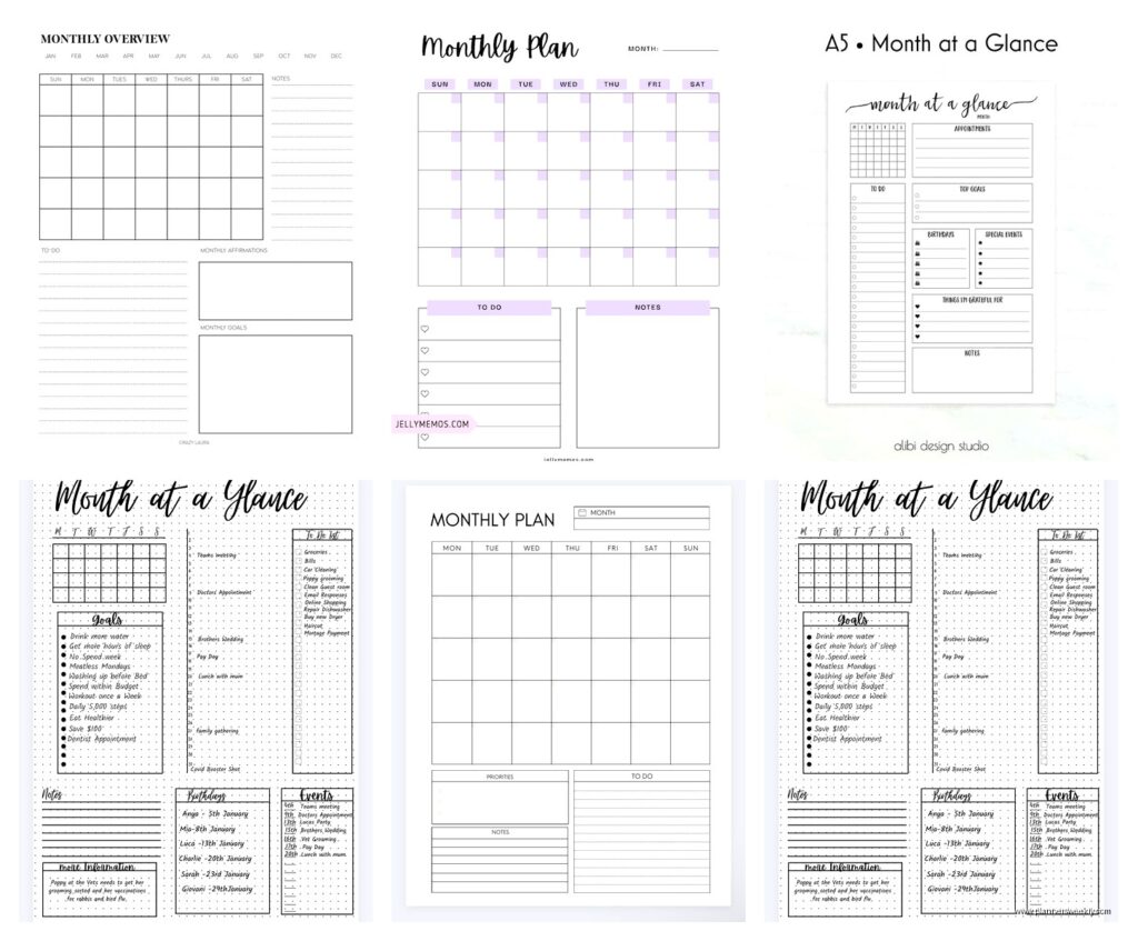
So the basic At a Glance monthly planner is that spiral-bound one you see everywhere. It’s like 8.5 x 11 inches and comes in black or maybe navy if you’re lucky. I grabbed the black one first because my dog literally ate the corner of my old planner and I needed something fast. Here’s the thing – it’s totally functional but kinda boring? The pages are thick enough that pen doesn’t bleed through which is huge for me because I use those Pilot G2 pens that are basically ink bombs.
Each month gets a two-page spread with those little boxes for every day. There’s ruled lines in each box which I actually love because you can fit like 4-5 things per day without it looking chaotic. The tabs on the side make it super easy to flip to whatever month you need. At the bottom of each month there’s a notes section that I always think I’ll use but never do.
Best for: people who just need to see their month at a glance (obviously) and don’t need weekly breakdowns. My clients who run small businesses love this one because they can map out content calendars or track project deadlines without getting into the weeds.
Wait I Forgot to Mention the Size Options
So there’s actually like four different sizes and this is where it gets confusing. The standard 8.5 x 11 is what most people get but there’s also a compact version that’s maybe 7 x 9 inches? I tested that one when I was trying to fit a planner in my purse and honestly it worked great until I realized I couldn’t read my own handwriting in those tiny boxes. If you have small handwriting or just do digital entry later, the compact is fine.
Then there’s the desk pad version which is hilarious because it’s HUGE. Like 22 x 17 inches. I had this on my desk for exactly two weeks before my cat knocked over my coffee directly onto it. But before that tragic incident, it was actually pretty cool for seeing your whole month while you’re working. You can write bigger notes, stick post-its on it, whatever. It’s just… you need desk space and I clearly didn’t have enough.
The Tiny One Nobody Talks About
There’s also this pocket-sized version that’s like 3.5 x 6 inches and honestly who is this for? I tried it thinking maybe it’d be good for keeping in my bag for quick reference but the boxes are so small you can maybe fit one word per day. Unless you have the neatest handwriting in the world or you’re just using it to mark which days you have ANYTHING scheduled, it’s not practical. Though I did give one to a friend who just wanted to track her gym days and she loved it so… maybe there’s a use case I’m missing.

The Premium Line – Yes It’s Actually Different
Okay so funny story, I bought the premium version thinking it was gonna be basically the same as the standard but with a fancier cover. Wrong. The premium At a Glance monthly planners have this padded cover that feels way nicer and the paper quality is noticeably better. Like you can use markers on these without worrying about bleed-through which the standard ones absolutely cannot handle.
The premium also has these extra pages at the beginning with goal-setting sections and project planning templates. I’m usually skeptical of that stuff because it feels like filler, but I actually used the project planning pages when I was organizing a workshop series. You get these little charts where you can break down big projects into phases which… okay I sound like I’m selling this but it genuinely helped me not forget stuff.
The tabs are also better quality – they’re laminated or something so they don’t get all bent and gross after a month. With the standard version, by June my tabs looked like my dog had been chewing them even though he definitely hadn’t.
Oh and Another Thing About Binding
Most of the At a Glance planners come spiral-bound but there’s a few with twin-wire binding which is basically the same thing but supposedly more durable? I haven’t noticed a huge difference honestly. The spiral ones have lasted me fine. There’s also a few models with sewn binding which lays flat better but you lose that satisfying spiral flip.
The desk pad versions obviously don’t have binding – they’re glued at the top and you tear off each month when you’re done. I kinda liked that because you’re not carrying around old months but also I’m the person who likes to flip back and see what I did in March so maybe that’s just me.
Color Coding and Design Options
This is gonna sound weird but the color options actually matter more than I thought they would. The standard line comes in pretty basic colors – black, navy, burgundy sometimes. But the premium line has these really nice colors like teal and gray that don’t show dirt as much. I have a burgundy one that now has mysterious stains on it and I’m not even sure how that happened.
Some of the newer designs have patterns on the cover which I thought would be cheesy but they’re actually pretty subtle. There’s one with geometric shapes that doesn’t look like it came from a corporate office supply catalog. My client who works in a creative field actually requested help finding a planner that didn’t look “accountant-y” and I recommended that one.
Inside, most of the planners are pretty plain – white or cream pages with black or blue printing. The premium ones sometimes have gray headers instead of black which is easier on the eyes if you’re staring at your planner all day. Small detail but when you’re using something daily it adds up.

The One With Stickers
I just found out they make a version that comes with sticker sheets and okay this feels very 2019 bullet journal energy but… they’re actually useful? The stickers are simple – just colored dots and little icons for things like appointments, deadlines, birthdays. If you’re a visual person who likes color-coding but doesn’t wanna commit to a whole color-pen system, the stickers work great. I used the red dots for urgent stuff and it made scanning my month way faster.
Academic Year Versions vs Calendar Year
So most people don’t realize At a Glance makes academic year versions that run from like July or August through June. If you’re a teacher or student obviously get that one, but I’ve also had clients who work in education-adjacent fields or just prefer that schedule get the academic year version. The layout is exactly the same, just different months.
The academic ones sometimes have extra reference pages like a three-year calendar or holiday lists which the regular calendar year ones don’t always include. Honestly I prefer having those reference pages even though I barely use them because the two times I needed to check what day Christmas falls on in 2025, it was right there.
Okay So Which One Should You Actually Buy
If you’re just tracking appointments and deadlines and want something simple: get the standard 8.5 x 11 monthly planner. It’s like $12-15 and does exactly what it needs to do. Don’t overthink it.
If you actually use your planner every single day and it’s gonna get beat up in your bag: spend the extra money on the premium version. The better paper and cover quality are worth it. I went through three standard planners in a year because they fell apart, versus one premium that lasted the whole year.
If you need something portable: the compact size works but test it first if you can because those small boxes aren’t for everyone. Maybe buy one at a store where you can return it if your handwriting doesn’t fit.
If you have desk space and like seeing everything at once: the desk pad is actually great. Just keep liquids far away and maybe don’t have a cat. My mistake.
Random Tips That Actually Matter
The planners don’t come with a pen loop which drives me insane. You’re gonna need to stick a pen in the spiral or get one of those adhesive pen holders. I use a binder clip to attach a pen to the cover because I’m classy like that.
If you’re using the monthly planner for work stuff, get two different colored pens – one for work tasks and one for personal. Sounds obvious but I didn’t do this for months and my planner was chaos. Now I use black for work and purple for personal and it takes me like two seconds to see what kind of day I have coming up.
The boxes are big enough for small post-its which I use all the time for things that might move. Like if I have a meeting that might get rescheduled, I write it on a post-it instead of directly on the page. Saves me from crossing stuff out and making it look messy.
Start your planner on a Sunday or Monday depending on what makes sense for your brain. At a Glance makes both versions. I’m a Sunday starter because I like seeing my weekend at the beginning of the row but my partner uses Monday start because that’s how he thinks about weeks. Neither is wrong, just pick what works for you.
The Weird Feature Nobody Uses
Most of the planners have these random pages at the back for notes or contacts or future planning. I never touched these until I started using the notes section for tracking monthly habits. Like I’ll write down at the end of each month how many times I worked out or whatever. It’s not structured for that but it works and those pages were just sitting empty anyway.
What Doesn’t Work Well
The planners don’t have weekly views so if you need hourly scheduling, this isn’t it. You’ll need a separate weekly planner or a different product entirely. I use the monthly for overview and then my phone calendar for daily time blocking.
The spiral binding catches on stuff in your bag. I’ve had my planner pull threads out of my purse lining which is annoying. Some people put the planner in a zippered pouch to prevent this but that’s extra bulk.
If you write really big, the boxes might not be enough space. My dad tried using one and was like “I can fit maybe two words per day” because he has giant handwriting. He ended up using abbreviations which worked but wasn’t ideal.
The cover designs, while improved, are still pretty corporate looking. If you want something aesthetic for Instagram or whatever, this probably isn’t gonna be your favorite. They’re functional, not fashionable. Though honestly who’s judging your planner anyway.
My client canceled yesterday so I spent like an hour comparing the premium versus standard side by side and honestly the differences are subtle. If you’re on a budget, the standard is totally fine. The premium is nicer but not life-changing. I’d say if you can afford the premium and you’re gonna use it daily, go for it. If you’re experimenting with monthly planning or might not use it consistently, save your money and get the standard.
The real question is whether monthly planning even works for your brain. I love it because I need to see the big picture, but some people really need weekly or daily layouts to function. At a Glance monthly planners are great at what they do but they’re not magic. If you’ve never used a monthly planner before, maybe grab the cheapest version first and see if you actually use it before investing in the premium line.