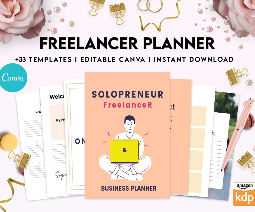
 Planning Work from Home, Solopreneur Freelancer Planner, Client Management , Work from Home, Small Business, Canva Editable Templates
 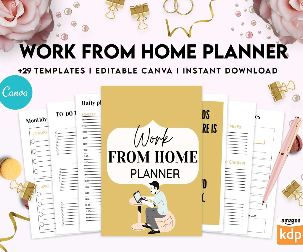 Work from Home Planner, Productivity Working from Home, Freelancer Solopreneur Business Planner, Canva Editable Templates
 Digital Productivity, Online planners, Planners, Planners Design
At a Glance 2026 Weekly Planner: Full Product Review

Feb
Okay so I’ve been using the At a Glance 2026 weekly planner for the past month and honestly I have THOUGHTS because this isn’t my first rodeo with their planners but this year’s version has some changes that caught me off guard.
The Actual Layout and What You Need to Know
First thing, the weekly spread is vertical which might seem obvious but I tested both their horizontal and vertical layouts last year and the vertical is so much better for people who actually time-block. Each day gets its own column running from 7am to 8pm in 30-minute increments. There’s also this notes section on the right that’s actually usable, not like those tiny boxes some planners give you that fit maybe three words.
The pages are thick enough that my Pilot G2 pens don’t bleed through which is huge because last year’s Moleskine disaster taught me to always test the paper first. I spilled tea on one page accidentally (was watching The Bear and got too into it) and the paper held up surprisingly well, just a little wrinkly but totally still usable.
Size Options Because This Actually Matters
They make this planner in like four different sizes and I gotta say the 8.5 x 11 inch version is the sweet spot for most people. The smaller ones are cute and portable but if you’re actually planning a full workday with multiple projects you’re gonna run out of space real fast. I carry mine in a basic tote bag and it fits fine with my laptop.
The compact version (5 x 8 inches I think?) is good if you’re minimalist or just tracking appointments not full task lists. My client Sarah uses that one and swears by it but she also only schedules like four things a day max so your mileage may vary.
What the Cover Situation Is Like
The standard cover is this weird navy blue faux leather thing that looks more professional than it has any right to. It’s not gonna win design awards but it doesn’t look childish in meetings which matters if you’re bringing this to client calls. There’s also black and red options but I haven’t tested those personally.
The binding is twin-wire which lays flat completely and this is actually a game changer when you’re writing. Nothing worse than fighting with a planner that wants to snap shut on you.

The Monthly View Pages
Oh and another thing, before each month starts there’s a two-page monthly calendar spread. The boxes are actually decent sized, like you can fit 3-4 items per day without it looking insane. I use these for deadline tracking and bigger picture planning while the weekly pages handle my day-to-day chaos.
One weird thing they do is put holidays in there already which sounds helpful but they include some random ones I’ve never heard of and it clutters the view a bit. You can ignore them but they’re printed right there in the date boxes.
The Reference Pages Everyone Forgets About
Back of the planner has like 20 pages of reference stuff. Future planning pages for 2027, contacts pages (which honestly who uses anymore but they’re there), and some blank note pages. I actually use those blank pages a ton for brain dumps during meetings.
There’s also this year-at-a-glance page in the front that spans 2026 and part of 2027 which is useful for blocking out vacation time or seeing how projects space out across quarters.
Comparing It to Other Weekly Planners I’ve Tested
So compared to the Blue Sky planners everyone’s obsessed with right now, the At a Glance is way more business-focused and less decorative. Blue Sky has prettier covers and more lifestyle content but the actual planning space is smaller. If you want something that feels like a tool not an accessory, At a Glance wins.
The Passion Planner has more goal-setting framework built in which some people love but I find it gets in the way if you already have your own system. At a Glance is more neutral, it just gives you the structure and gets out of your way.
Wait I forgot to mention the Erin Condren comparison because people always ask. Erin Condren is gorgeous and customizable but costs literally three times as much and the paper quality isn’t that different honestly. At a Glance is like $15-20 depending where you buy it, Erin Condren is pushing $60.
Paper Quality Deep Dive
The paper is 20lb which is standard but it feels substantial. It’s not that buttery smooth premium paper you get in luxury planners but it’s not scratchy either. Fountain pens might have issues but normal ballpoints, gel pens, and even most felt tips work fine.
I tested it with highlighters too because I’m obnoxious about color coding and there was minimal ghosting on the back. You can see a shadow of the highlighter but it doesn’t interfere with writing on the reverse side.
Who This Planner Actually Works For
If you’re someone who needs to see your whole week at once and you schedule your days in chunks of time, this is your planner. It’s perfect for people with back-to-back meetings, multiple projects happening simultaneously, or anyone who time-blocks their workday.
It’s NOT great for people who want daily pages with tons of space for journaling or reflection. The daily columns are practical not spacious. Also if you hate structure or prefer bullet journaling where you create your own layouts, this is gonna feel restrictive.
I use mine for client sessions, content deadlines, and blocking out deep work time. My dog’s vet appointments are in here too because I learned the hard way that keeping separate calendars for personal and work stuff means I double-book myself constantly.
The Actual Functionality Day to Day
One thing I really appreciate is the weekend gets equal space as weekdays. Some planners shrink Saturday and Sunday into little boxes but At a Glance gives them full columns. If you work weekends or just want to plan personal stuff with the same detail as work stuff, this matters.

The hourly increments start at 7am which is early enough for most people but if you’re a 5am workout person you’ll need to write above the lines. The evening goes to 8pm which is fine for after-work activities but not if you’re planning late-night stuff.
Weird Quirks I Noticed
This is gonna sound weird but the planner starts on a Sunday not a Monday. Some people have strong feelings about this. If you think of Monday as the week start it takes some mental adjustment. You can just ignore Sunday and start each spread on Monday but then you have Sunday floating at the end which feels off.
The pages have this light gray grid pattern that helps keep your handwriting straight but it’s subtle enough that it doesn’t feel like you’re writing on graph paper. Small thing but it helps with neatness.
There’s a bookmark ribbon attached which actually stays put unlike some cheap planners where it falls out after two weeks. I keep mine on the current week obviously.
Where to Actually Buy It and Pricing
Amazon has it, Target usually stocks them, office supply stores always have At a Glance products. I got mine at Target for $17 which felt reasonable. I’ve seen it as low as $13 on Amazon during back-to-school sales.
Don’t buy it at one of those airport bookstores because they mark everything up like crazy. My friend paid $25 for the same planner at an airport Hudson News which is just ridiculous.
The Longevity Question
I’ve been using At a Glance planners for three years now and they hold up well. The binding doesn’t fall apart, the cover doesn’t get gross and bent. By December the planner definitely looks used but it’s not falling apart or anything.
The wire binding can snag on stuff in your bag occasionally which is annoying but hasn’t caused actual damage in my experience. Just something to be aware of if you’re precious about keeping things pristine.
The Features That Actually Get Used
Okay so funny story, planners always include these like vision board pages or goal tracking sections that I never touch. At a Glance keeps that stuff minimal which I appreciate. There’s a couple goal pages at the front but they’re not shoved in your face every week.
The contacts pages I mentioned earlier, I thought I’d never use them but actually when my phone died during a conference I was really glad I’d written down a few key numbers in there. So maybe not totally useless.
Each week has a little checkbox next to each day which seems pointless but I use them to mark when I’ve reviewed that day’s tasks. Tiny thing that helps me stay on track.
Real Talk About Digital vs Paper
I use Google Calendar for shared calendars and appointments that other people need to see, but this planner is where I actually plan my days. Digital is for coordination, paper is for thinking. That’s my system anyway.
The act of writing things down in this planner helps me process my schedule better than just looking at a screen. If you’re fully digital and it works for you, cool, but if you’ve been trying to make digital planning work and it feels off, paper might be the answer and this is a solid entry point that isn’t expensive.
The At a Glance 2026 planner is basically the reliable Honda Civic of planners. Not exciting, not gonna impress anyone on Instagram, but it’s functional and dependable and gets the job done without drama. For twenty bucks you really can’t go wrong if weekly planning is your style.