Digital Productivity, Online planners, Planners
Digital Planner Template: Create Custom Digital Planners
Apr
Okay so I just spent like three weeks making digital planners for different platforms and honestly the biggest thing nobody tells you is that you need completely different approaches depending on where people will actually USE the thing.
GoodNotes is Basically Where You Should Start
GoodNotes is weirdly the easiest to work with because people are super forgiving about design there. I made my first template in Keynote – yeah, KEYNOTE, not even proper design software – and it worked fine. The thing with GoodNotes is you’re basically just making a PDF with hyperlinks. That’s it. Export as PDF, add your links, done.
Here’s what actually matters though. Your page size needs to be consistent and I learned this the hard way after making like 40 pages in portrait and then realizing my client wanted landscape. Go with either standard iPad size (1620 x 2160 pixels for portrait) or do the landscape version (2160 x 1620). I usually work at 300 DPI because it keeps everything crisp when people zoom in to write.
The hyperlinks are gonna be your tabs and buttons. In Keynote or PowerPoint you can just add shapes, then add hyperlinks to specific pages. Export the whole thing as PDF and the links come through. In Canva Pro you can do the same thing but honestly Canva’s hyperlink feature is kinda buried in the interface and I always forget where it is.
The Tab System That Actually Works
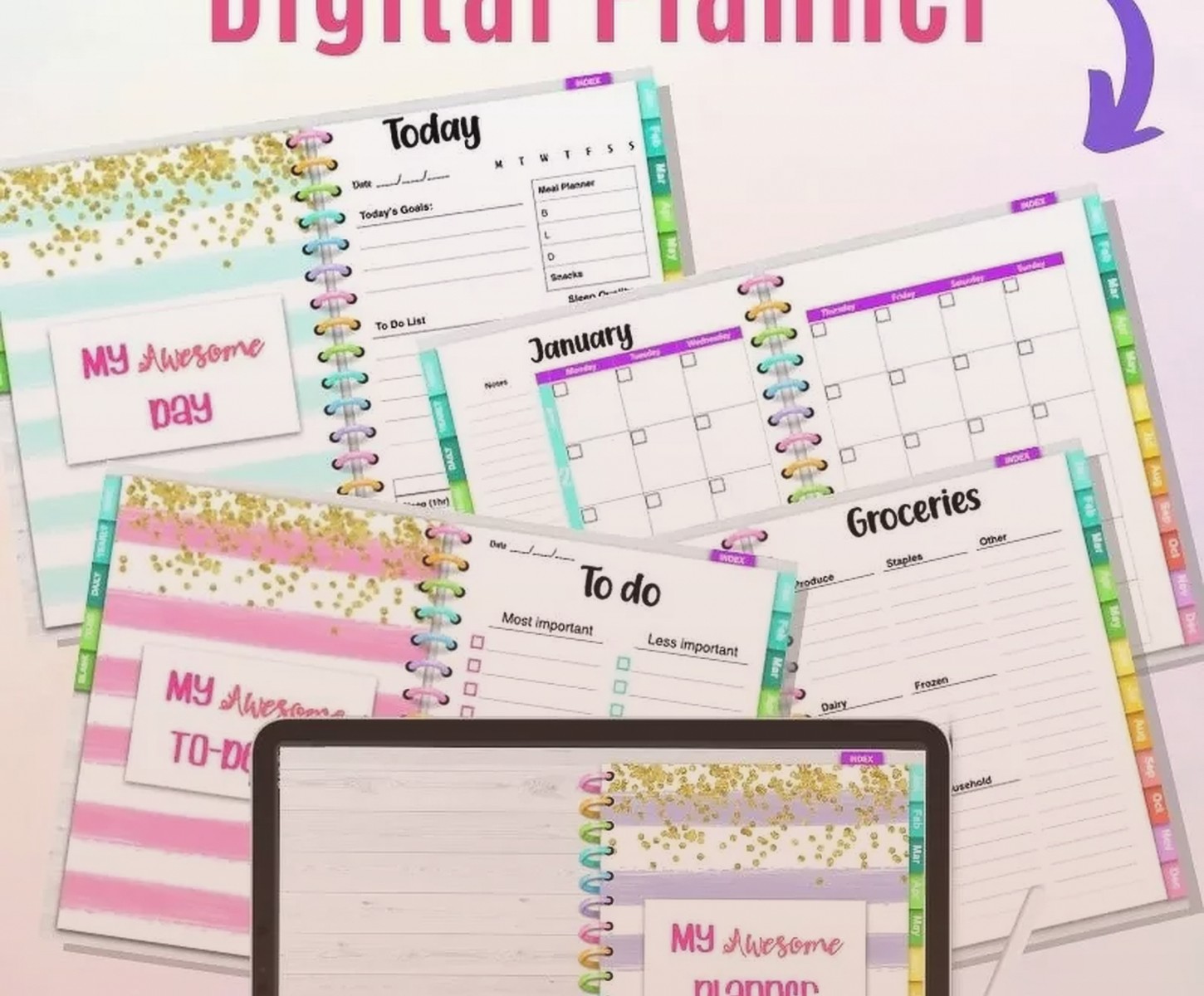
Don’t make those tiny little tabs everyone puts on the side. They look cute but they’re impossible to tap accurately. I make mine at least 100 pixels wide, more like 120-150 if I can. Put them across the top or in a obvious spot on each page. Link them to your main pages – monthly view, weekly view, daily pages, notes section, whatever you’re including.
Oh and another thing – include a home button on EVERY page. Just a little house icon or something in the same spot on each page. Link it back to your main navigation page. People get lost so easily in digital planners and this saves them from that annoying thing where they’re swiping through 50 pages trying to find the monthly view again.
Notability Needs Different Files Entirely
So Notability is weird because it doesn’t really do hyperlinks the same way. You CAN add them but it’s not as smooth. What works better is making shorter PDF files – like separate files for each month or each section. Then people import multiple files and switch between them using Notability’s subject system.
I made this mistake where I created a 365-page daily planner as one file and my friend who tested it was like “this is completely unusable, I’m scrolling forever to find anything.” She was right. Break it up into chunks.
The paper size thing is also different – Notability users seem to prefer the standard US Letter size (8.5 x 11) or A4. I think because Notability feels more like a notebook app than a planner app? The workflow is different.
Actually Test Your Hyperlinks
This is gonna sound obvious but I’ve released templates where half the links didn’t work because I didn’t check them after making changes. When you’re in your design software and you move pages around or add new pages, your hyperlinks can break. Always do a final check where you literally click every single button and tab. I put on a podcast and just click through the whole thing. My dog thinks I’m insane because I’m just tapping my iPad for like 20 minutes straight.
Samsung Notes is The Forgotten Platform
Okay so Samsung users get really annoyed that everyone designs for iPad and nobody thinks about them. Fair point. Samsung Notes works great with PDFs too but the aspect ratios are different. Galaxy Tab sizes vary but a common one is 2560 x 1600 pixels for the Tab S series.
The pen experience is different too – the S Pen has that button on the side so people use different gestures. I actually don’t own a Samsung tablet so I had my client test this for me and she said the main thing is making sure your tap targets are big enough because the screens are sometimes smaller.
Wait I forgot to mention – Samsung Notes has this thing where you can add voice recordings to pages. So if you’re making planners for students or people who take meeting notes, you could add little icons or sections that remind them they can record audio there. It’s not something you build into the template exactly, but designing space for it is smart.
The Actual Design Software Breakdown
Canva Pro
Everyone starts here because it’s easy and the templates are already there. You can literally search “digital planner” and modify existing ones. The problem is that like 80% of digital planners on Etsy are just modified Canva templates and they all start looking the same.
If you’re gonna use Canva, at least customize the colors and fonts significantly. And add your own elements. The free elements are fine but everyone recognizes them. I subscribe to Creative Fabrica and download element packs from there to make mine look different.
Canva’s good for testing ideas quickly though. I’ll sketch out a layout concept in Canva in like 20 minutes just to see if the flow makes sense before I commit to building it properly.
Keynote or PowerPoint
This sounds janky but honestly for your first template just use presentation software. You already know how it works, the hyperlinks are straightforward, and it exports clean PDFs. I made a whole product line in Keynote before I learned Adobe InDesign and they sold fine.
The limitation is that your design options are more basic. You’re not gonna get super intricate illustrative elements without importing them. But for clean, functional planners? Totally fine.
Adobe InDesign
This is where you go when you’re serious. InDesign handles multi-page documents better than anything else and the typography controls are actually good. You can set up master pages so your headers and tabs appear consistently across all pages without copying and pasting 100 times.
The learning curve is real though. I watched like 15 YouTube tutorials before I figured out how to add hyperlinks properly. You have to use the Buttons and Forms panel and it’s not intuitive at all. But once you get it, you can create really professional templates.
InDesign also lets you export with different PDF settings which matters for file size. A 200-page planner can be like 50MB if you export wrong, or 5MB if you compress it right. People will not download a 50MB planner template, they’ll just refund it.
Affinity Publisher
This is like InDesign but cheaper – you pay once instead of subscribing. I switched to this for a while when I was annoyed at Adobe’s pricing. It does basically everything InDesign does for digital planners. The hyperlink system is actually easier to understand.
The only issue is fewer tutorials online. When you get stuck you’re searching forums instead of finding a quick YouTube fix. But for the price difference it’s worth it if you’re just starting out.
Stuff That Actually Makes Your Planner Better
Blank Note Pages
Just add like 20 blank pages at the end. People always want extra note space and they get annoyed when they run out. Make them blank or with just a simple dot grid or lines. Link to them from your main navigation so people can find them easily.
Stickers and Elements
Okay so this is controversial but I don’t include moveable stickers in my planners anymore. People expect them but they make the file size huge and honestly most people don’t use them. What I do instead is include a separate PDF with sticker elements that people can copy and paste if they want. This keeps the main planner file small and fast.
If you DO include stickers, make them actual separate elements in a PNG format that people can import, not built into the PDF itself.
Monthly, Weekly, Daily – Pick Your Battle
You don’t need all three unless you’re making a massive comprehensive planner. I actually sell better when I make focused products – like just a weekly planner, or just a daily one. People know what they want and they don’t wanna pay for pages they won’t use.
My best seller is actually just a weekly layout with basic monthly overview pages. That’s it. Simple but functional.
The Technical Stuff That Trips People Up
Layers and Transparency
When you export to PDF, make sure you’re flattening any transparency effects. I had this issue where my gradient backgrounds looked perfect in Canva but came out with weird banding in the PDF. Flattening fixed it.
Also don’t go crazy with layers. Keep your design relatively flat or the file size explodes. I learned this when my planner was 80MB and nobody could download it from my shop.
Color Mode
Work in RGB, not CMYK. Digital planners are for screens not printing. RGB gives you brighter colors and better file compatibility. I switched a whole template from CMYK to RGB once and the colors looked SO much better on iPad.
Font Embedding
When you export your PDF, make sure fonts are embedded or people will see default fonts instead of your design. In InDesign this is a checkbox in the export settings. In Canva it happens automatically. In Keynote you sometimes have to outline text as shapes to preserve the look, which is annoying but necessary.
Testing Before You Release Anything
Send your planner to at least three people who use different apps and devices. I have a little testing group – one person uses GoodNotes on iPad, one uses Notability, one uses Samsung Notes. They all test my templates before I list them and catch stuff I miss.
The main things they check are whether hyperlinks work, whether the file opens properly, whether anything looks weird on their screen size, and whether the overall navigation makes sense. You’d be surprised how many things seem obvious to you as the designer but confuse actual users.
My cat just knocked my iPad off the desk while I was testing a template last week and I had a minor heart attack but it was fine, just fyi get a good case.
Pricing Reality Check
Don’t underprice these. I see people selling comprehensive digital planners for like $3 and it’s wild. If you put actual work into it charge at least $12-15. Mine range from $8 for simple ones to $28 for the really detailed ones with lots of pages. They sell fine at those prices because people understand they’re getting something functional and well-designed.
The race to the bottom on Etsy is real but you don’t have to participate in it. Focus on making actually good products instead of competing on price with templates people made in 45 minutes.