Digital Productivity, Online planners, Planners
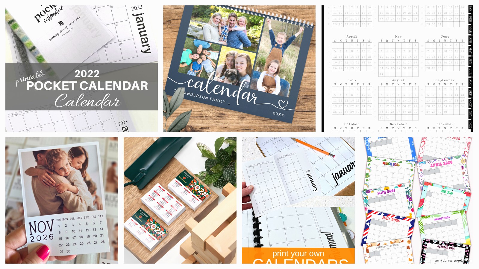
Personalized 2026 Pocket Calendar: Custom Options

Feb
Okay so I’ve been deep in the personalized pocket calendar rabbit hole for 2026 and here’s what you actually need to know because there are SO many options and most of them are kinda garbage honestly.
The Photo Upload Situation
Most services let you upload photos for the cover but here’s the thing – the resolution requirements are all over the place. Shutterfly wants at least 1800×2400 pixels for a pocket calendar or it’ll look blurry as hell. I tested this with a photo from my phone and it looked fine on screen but printed? Absolutely terrible. You need the high-res version or don’t even bother.
Vistaprint is more forgiving with resolution but their color saturation is weird. Everything comes out slightly more orange than you’d expect which… I mean if you’re using beach photos maybe that works but I tried to use a photo of my office setup and it looked like I’d applied some weird Instagram filter from 2012.
Oh and another thing – if you’re doing a photo cover, pick something high contrast. I made one with this gorgeous minimalist shot that looked amazing on my computer but in pocket calendar size all the detail just disappeared. It looked like a blob of beige.
Text Personalization That Actually Matters
So you can usually add your name or whatever on the cover but let’s talk about the inside pages because THAT’S where it gets interesting. Some services let you add custom dates and that’s honestly the most useful feature nobody talks about.
I use Minted for client gifts and you can pre-mark birthdays, anniversaries, recurring meeting dates – whatever. Costs like $3 extra but then you’re not spending the first week of January writing in all the dates you know you’re gonna need. My cat knocked over my coffee while I was setting this up which actually made me realize you want a service that saves your progress because I lost like 20 entries and had to start over.
Artifact Uprising lets you add little text boxes on specific dates. Super useful if you wanna put inspirational quotes or… okay this is gonna sound weird but I put meal prep reminders on mine because I’m 40 and apparently that’s where we’re at now. Every Sunday it says “make the damn salads Emma” and honestly it helps.
The Font Trap
Everyone gets excited about custom fonts and then picks something totally unreadable at pocket calendar size. I did this. Chose this beautiful script font for my 2025 one and couldn’t read ANY of my appointments without my reading glasses.
Stick with sans serif fonts for anything that’s actual information. You can get fancy with your name on the cover but the dates and text inside? Keep it simple. Trust me on this.
Layout Options Nobody Explains Properly
There are basically three layouts for pocket calendars and the websites do a terrible job explaining which is which.
Monthly view is the standard – you get one month per page or spread, whole month visible at once. This is what most people mean when they say pocket calendar. Good for seeing your whole month but writing space is tiny.
Weekly view gives you more writing room per day but you can only see one week at a time. I thought I wanted this because I write a lot of appointments but flipping pages constantly drove me insane. Returned that one.
Then there’s the monthly-with-notes-section which is like… a hybrid? Month on one side, lined space on the other. This is actually my favorite for 2026 planning because you can see the month AND have room for random notes. Papier does this layout really well and lets you customize the notes section with prompts or categories.
Cover Material Real Talk
The default is usually cardstock which is fine but gets gross in your bag after like two months. Everything pills up and the corners get bent.
Leather or faux leather costs more but actually holds up. I’ve been using a leather cover one from Leatherology since March and it still looks new. They let you add monogramming which feels fancy but also helps when you inevitably leave it somewhere and need to prove it’s yours.
Wait I forgot to mention – some places offer laminated covers which sound practical but they’re SO slippery. Mine kept sliding out of my bag, fell on the street twice, finally fell in a puddle and the water got in through the spiral binding and warped half the pages. Just… skip laminated.
Spiral vs Perfect Bound
Spiral binding lays flat which is chef’s kiss for actually using the calendar but it catches on EVERYTHING in your bag. I pulled mine out at a meeting once and it brought three receipts and a granola bar wrapper with it.
Perfect bound looks cleaner and fits in pockets better but you gotta kinda hold it open with force and that’s annoying when you’re trying to write. There’s this middle option called spiral-bound-with-cover-flap that Moleskine does where the spiral is protected. More expensive but probably worth it.
The Custom Holidays Thing
Okay so funny story – I ordered a batch of personalized calendars as client gifts last year and didn’t realize the default was US holidays only. Half my clients are in Canada and the UK and it looked SO lazy that their holidays weren’t marked.
For 2026 make sure you check which holidays are pre-printed. Most services let you choose your country/region but you have to actively select it. And if you’ve got specific observances you follow – religious holidays, cultural celebrations, whatever – see if you can add those custom.
Printerpix has the most flexible holiday customization I’ve found. You can basically add whatever you want. I put “Hamilton’s birthday” on mine because I’m that person who celebrates their pet’s birthday apparently.
Color Coding Inside Pages
Some premium services let you color code different types of events or even have different colored pages for different months. Sounds gimmicky but it’s actually super useful if you’re visual like me.
I did a test run with Snapfish where work stuff was blue, personal was purple, and health appointments were green. Made it SO much easier to see at a glance what kind of day I was looking at. The color coding costs extra though and honestly if you’re on a budget just get colored pens and do it yourself.
Size Actually Matters Here
Everyone says pocket calendar but there’s like… a range. True pocket size is usually 3.5×5.5 inches which fits in most pockets but is cramped for writing. The 4×6 size is technically still pocket-ish and way more practical.
I carry the 4×6 size in my bag not my actual pocket because let’s be real women’s pockets are useless anyway. If you actually need it in your pocket get the smaller one but be prepared to write TINY or use abbreviations for everything.
There’s also a 5×7 size some places call a pocket calendar which is just… a lie? That’s a regular small calendar. Not pocket anything unless you’re wearing cargo pants I guess.
The Back Pages Situation
Most personalized calendars let you customize the back pages with contacts, passwords (don’t do this), notes sections, goal tracking, whatever. Actually use this space because it’s included in the price anyway.
I put a year-at-a-glance page in the back which seems redundant but it’s genuinely helpful for long-term planning. Also added a books-to-read list because I was watching that show about the bookshop and got inspired, ended up actually using it way more than I expected.
Some services let you add dot grid or lined pages in the back. The dot grid is more versatile if you’re gonna use it for random notes and sketches and whatever.
Bulk Ordering Considerations
If you’re getting these as gifts or for your team the price drops significantly at like 10+ calendars. But here’s the catch – most places make you use the SAME design for bulk pricing.
Zazzle lets you order different designs and still get bulk pricing which is clutch if you want them personalized with individual names. Did this for my team last year, everyone got their name on the cover with the same interior layout. They actually used them which never happens with corporate gifts.
Lead time for bulk orders is usually 3-4 weeks so don’t wait until December to order 2026 calendars. I’m literally ordering mine now in… wait what month is it… anyway I’m ordering early because November/December is chaos.
The Weird Extra Features
Okay so some services have these random add-ons that sound useless but might actually be perfect for your specific situation.
Sticker sheets that match your calendar – surprisingly useful for color coding or marking important dates. Got these with my Erin Condren order and thought they’d sit in a drawer but I actually use them.
Matching bookmark/ruler – seems extra but if you’re flipping through months a lot it helps you not lose your place. Plus you can use it to underline dates or draw straight lines if you’re adding notes.
Clear vinyl cover – protects your custom photo cover from getting scratched. Adds bulk though so if you’re tight on space skip it.
Elastic band closure – keeps your calendar from flopping open in your bag and potentially writing on itself if you leave a pen in there. This happened to me. There’s now a mysterious blue line across March 15th.
Digital Integration Options
A few services are starting to offer QR codes you can add to pages that link to your digital calendar or specific event pages. Sounds techy and unnecessary but actually if you maintain both digital and paper systems this bridges the gap nicely.
I added QR codes to my major project deadlines that link to my Notion pages with all the details. Means I can keep the calendar entry simple but access everything if needed. Very extra, kinda genius though.
Common Mistakes I Made So You Don’t Have To
Ordering too early before the templates are finalized – I ordered a 2026 calendar in like May and they didn’t have all the features ready yet so I got a basic version. Wait until at least summer/fall of 2025 for full options.
Forgetting to check if week starts on Sunday or Monday – seems small but if you’re used to one way and your calendar is the other it’ll mess you up constantly. Most services let you choose but it’s buried in settings.
Going too minimal on the design – I thought I wanted this super clean aesthetic calendar and then had nowhere to write anything beyond the basic appointment time. If you actually use your calendar make sure there’s enough space.
Not proofreading custom text – had “Emma Collons” on 50 calendars once. That was expensive.
Choosing trendy colors that you’re gonna hate in three months – your calendar needs to last all year so maybe skip the millennial pink and go with something more neutral. I say this as someone with a millennial pink 2024 calendar I stopped using in April because I couldn’t stand looking at it anymore.
The paper quality thing matters more than you think. Cheap paper and ink bleed through happens. I spilled coffee on one which wasn’t the test I planned but it showed me that better paper actually repels liquid better and dries without warping as much. Go for at least 80lb paper if they list the weight.