Digital Productivity, Online planners, Planners
Weekly Timetable Planner: Best Scheduling Templates
May
Okay so I just spent the last three weeks testing literally every weekly timetable planner I could get my hands on and here’s what actually works.
The basic template everyone recommends is that standard hourly grid right? Like Monday through Sunday across the top, time slots down the side. I’ve been using these for years with clients and honestly the hourly increment matters more than people think. If you get one with 30-minute blocks, you end up with this massive planner that’s annoying to carry around. The hour blocks work better unless you’re scheduling back-to-back appointments all day, which if that’s your life… we need to talk about buffer time but that’s a different conversation.
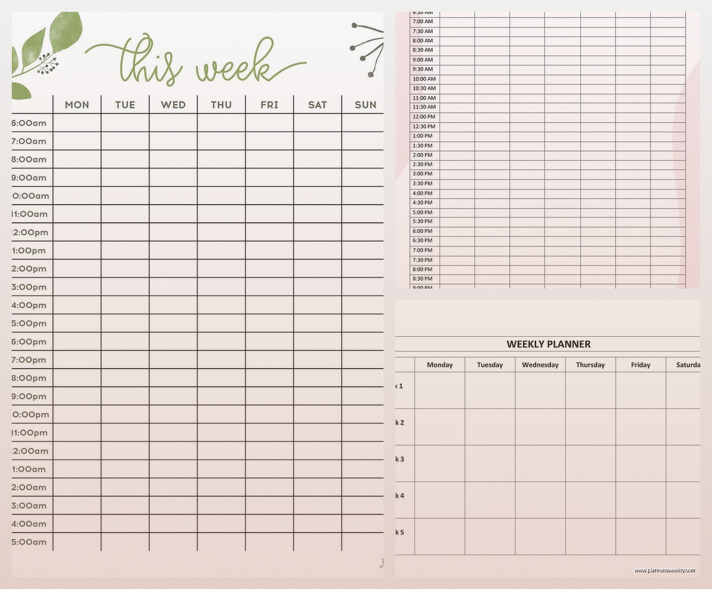
The Classic Vertical Layout
Most people start here and honestly it’s solid. Days go across the top, hours go down from like 6am to 9pm or whatever. I tested the Passion Planner weekly layout first because my client Sarah swears by it and the time blocking is genuinely good. Each day gets a column and you’ve got those hourly divisions. What I like is you can see your whole week at a glance without flipping pages.
But here’s the thing I noticed after using it for two weeks straight – if you have a really packed Tuesday and a super light Thursday, the visual balance looks weird? And it kinda messes with your head. You start feeling like you need to fill the empty spaces even when you shouldn’t.
Time Slot Considerations
The 7am-7pm range is pretty standard but I’ve found starting at 6am gives you space for morning routines without cramming it at the top. Some templates go until 10pm which sounds good in theory but then you’re scheduling your evening and it stops feeling like downtime. This is gonna sound weird but I actually prefer when the evening section is just blank or has a small notes area instead of time slots.
Oh and another thing – some templates have these tiny boxes for each hour and you can barely write “team meeting” without abbreviating. The Volt Planner has bigger boxes and I could actually fit “team meeting re: Q2 budget + bring report” which turns out to be important when you’re juggling multiple projects.
Horizontal Weekly Spreads
Wait I forgot to mention the horizontal layouts. These are where the days stack vertically and your hours go across. I thought these would be terrible but my friend convinced me to try the Clever Fox layout and… it’s actually better for certain work styles?
If you work in chunks rather than appointments, the horizontal view makes more sense. Like if you’re a writer or designer and you block out “morning: client work, afternoon: admin stuff” instead of “9am: call with Jane, 10am: review contract” – the horizontal gives you these nice big rectangles per day.
I tested this during a week where I had three big project deadlines and barely any meetings. Worked great. Then the next week I had 12 appointments scattered throughout each day and I wanted to throw the planner across the room because I couldn’t see the time relationships clearly.
The Two-Page Spread Problem
Most horizontal layouts need a two-page spread to fit the whole week. Monday through Wednesday on the left page, Thursday through Sunday on the right. Sounds fine until you’re planning on Monday and need to see what’s happening Friday and the binding is in the way. This drove me absolutely crazy with the Panda Planner. Beautiful design, terrible usability for cross-referencing days.
Digital Templates vs Paper
Okay so funny story – I’m obviously a paper planner person, that’s literally part of my job, but I tested Google Sheets templates and Notion templates because so many people asked. The Excel weekly timetable templates are actually super functional if you don’t care about aesthetics.
There’s this free template from Vertex42 that has automatic time calculations. You can enter a task duration and it’ll block out the time automatically. For someone who bills by the hour or tracks time meticulously, this is huge. I used it for a week to track a project and it saved me probably 20 minutes of manual calculation.
But typing everything in feels slower than handwriting for quick planning. And I found myself not opening the file as often as I flip through a physical planner. My cat knocked over my coffee on my desk last Tuesday and I was grateful my planner wasn’t digital, so there’s that.
Printable PDF Templates
The middle ground is printable templates. You get the structure of digital with the tactile benefit of paper. I downloaded like 15 free ones from various productivity blogs and Etsy shops. Quality varies wildly.
The best one I found was from a seller called MinimalPlannerCo – it’s got clean lines, hourly blocks from 6am-9pm, and a notes section at the bottom of each day. It’s $5 for the template file and you can print unlimited copies. I’ve been printing mine on 32lb paper instead of regular printer paper and punching holes for a binder. Works perfectly.
The free templates from sites like Template.net are fine but often have weird formatting. One I downloaded had the hours in a font so decorative I literally couldn’t read if it said 2pm or 3pm.
Specialized Weekly Layouts
Some templates get really specific about use cases. There’s weekly meal planner templates that have breakfast, lunch, dinner slots for each day plus a grocery list section. I tested one of these even though I don’t meal plan religiously because a client asked about it.
The Template Trove meal planning weekly spread is actually genius if you’re into that. Each day has three meal slots, there’s a prep notes section, and the shopping list divides by store section (produce, dairy, etc.). Used it for two weeks and definitely wasted less food because I could see what ingredients I needed to use up.
Workout and Habit Tracking Timetables
Then there’s weekly workout schedulers which are essentially timetable planners but with exercise-specific fields. The one from Canva’s template library (you can customize it) has time slots plus spaces to track sets, reps, and how you felt. If you’re training for something specific this beats a regular planner.
I tested this while getting back into running – my workout schedule was all over the place and having dedicated boxes for “planned workout” vs “actual workout” was surprisingly motivating. You can see immediately when you’re skipping stuff.
The Priority-Based Weekly Layout
Wait I need to mention priority planners because they’re technically timetables but structured differently. Instead of hours, you’ve got priority levels – urgent, important, can wait, etc. The Eisenhower Matrix weekly template does this.
Each day is divided into four quadrants: urgent-important, not urgent-important, urgent-not important, not urgent-not important. You slot tasks into these instead of time blocks. I used this for a particularly chaotic week where everything felt urgent and it actually helped me see that like 60% of my “urgent” tasks weren’t really urgent.
The problem is you still need to schedule the actual tasks somewhere, so I ended up using this alongside a regular timetable planner which defeated the simplicity purpose.
Blank vs Structured Templates
Some weekly templates are completely blank except for day labels. Just seven boxes, you fill in whatever structure you want. I thought I’d love the flexibility but it turns out I just recreate the same hourly grid every single week which is a waste of time.
The Leuchtturm1917 weekly planner is like this – minimal structure, lots of space. Great if you’re artistic or your schedule varies wildly week to week. For regular scheduling though, having the time structure pre-printed saves mental energy.
On the opposite end, some templates are SO structured they’re restrictive. One I tested had specific categories pre-printed: “Work Tasks,” “Personal,” “Family,” “Self-Care” with designated spaces for each. Sounds organized but what if you have a work-heavy week? Those family boxes just sit empty and mock you.
Size and Format Matters More Than You Think
The physical size of your timetable planner changes how you use it. I tested the same template layout in three sizes: full page (8.5×11), half-page (5.5×8.5), and personal size (3.75×6.75).
Full page gives you tons of writing space but it’s bulky. I kept leaving it on my desk instead of carrying it to meetings. Half-page was the sweet spot for me – fits in most bags, enough space to write actual sentences not just abbreviations. The personal size was cute but I had to write so small my hand cramped.
Oh and landscape vs portrait orientation is a whole thing. Landscape weekly spreads (horizontal orientation) give you wider day columns which is nice for detailed scheduling. Portrait (vertical) fits better in bags and on desk space. I’m using portrait currently because my desk is tiny and covered with planner samples… and coffee mugs… it’s a mess honestly.
Binding Types
If you’re printing your own templates, how you bind them matters. I’ve tried:
– Three-ring binder (easy to add pages, bulky)
– Disc binding (lies flat, pages can be rearranged, more expensive)
– Spiral binding (cheap, can’t add pages later)
– Clip binder (simple, pages can fall out if you’re not careful)
The disc binding system is what I’m using now. Got a Staples Arc notebook and print my weekly templates, punch them with the special punch, and add them. Being able to move pages around is actually super useful when you need to reference last week while planning this week.
Weekly Review and Reflection Sections
Some templates include a weekly review section at the end – questions like “What went well?” and “What needs adjustment?” I ignored these for ages because they seemed like fluffy productivity theater.
But then I actually filled them out for a month and it genuinely helped spot patterns. Like I realized I was scheduling important work on Friday afternoons when my brain is basically offline. Moved those tasks to Tuesday mornings and got way more done.
The Weekly Review template from the Full Focus Planner has good prompts. Not too many, not too vague. Takes maybe 5 minutes to complete.
Color Coding and Visual Systems
Whether your template has built-in color coding or you add it yourself changes usability. Some printable templates come with pre-colored sections – work in blue, personal in green, etc. Looks nice but what if your categories don’t match theirs?
I prefer blank templates where I add my own color system. Currently using:
– Orange for client work
– Green for admin/business tasks
– Blue for personal appointments
– Purple for creative projects
Takes an extra minute to add the colors but scanning my week visually is SO much faster. I can see immediately if I’m overloaded with client work and have no creative time blocked.
The Hybrid Approach That Actually Works
After testing everything, here’s what I landed on: a printed weekly template with hourly blocks from 6am-8pm, printed on good paper, in a disc-bound system. I color code by project type and add stickers for recurring tasks so I don’t have to rewrite “team meeting” every single Monday.
I keep a digital backup in Google Calendar for appointments that other people need to see, but I do my actual planning and time blocking on paper. The digital calendar sends me reminders, the paper planner is where I think through my week strategically.
This is gonna sound extra but I print two copies of my weekly template – one for planned schedule, one for what actually happened. Comparing them at the end of the week shows where I’m being unrealistic about time. Usually I’m cramming way too much into Wednesday for some reason.
The best template is honestly the one you’ll actually use consistently. I’ve seen people do amazing things with basic Excel grids and others abandon beautiful custom planners after a week. Test a few formats before committing to anything expensive. Print free templates, try them for at least two full weeks because the first week you’re just learning the system.
And if you’re scheduling for a family or team, get a template with multiple columns per day so you can track different people’s schedules in one view. The Cozi weekly template does this well – up to five people per household, color-coded, with a shared meal plan section at the bottom.