Digital Productivity, Online planners, Planners
At a Glance 2026 Weekly Planner: Product Review & Guide

Feb
Okay so I’ve been using the At a Glance 2026 weekly planner for about three months now because I got my hands on an early copy and honestly I have THOUGHTS. Like way more thoughts than I expected to have about what’s basically just another weekly planner but here we are.
The Basic Setup and What You’re Actually Getting
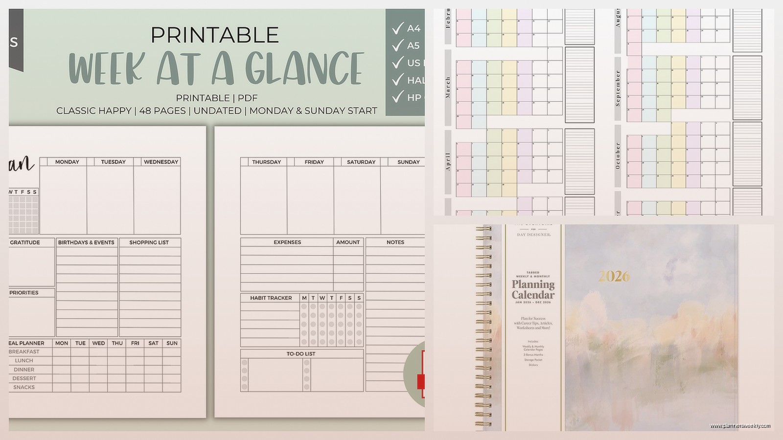
First thing you need to know is that At a Glance makes like seventeen different versions of their planners and it’s genuinely annoying to figure out which one people are talking about. The main weekly one most people mean when they say “At a Glance weekly” is the 70-950 model which runs from January 2026 through December 2026. It’s got the whole week laid out horizontally across two pages which I know sounds obvious but I’ve seen people get confused thinking it’s a vertical layout.
The size is what they call “desk size” which is 8.5 x 11 inches so it’s basically the same as a standard piece of printer paper. Not small. Not gonna fit in your purse unless you have like a tote situation going on. I mention this because last week a client bought one thinking it would work for her commute and yeah no that’s not happening.
Paper Quality Is Where It Gets Interesting
So the paper is this cream-colored stock that’s thick enough you won’t get bleed-through from most pens BUT and this is important I tested it with my Zebra Sarasa gel pens and there’s definitely some ghosting on the back. Not bleeding all the way through but you can see the impression of what you wrote. With a regular ballpoint you’re totally fine.
Oh and another thing the paper has this slightly rough texture that some people love and some people hate. I’m weirdly in the middle on it? Like it feels substantial when you’re writing which is nice but if you’re someone who writes really fast with a heavy hand it can feel almost scratchy. My dog knocked my planner off my desk the other day and pages didn’t tear so points for durability I guess.
Layout Quirks That’ll Either Work For You or Drive You Nuts
Each day gets its own column and the hours run from 7am to 8pm with half-hour increments. This is gonna sound weird but the spacing is just slightly cramped? Like you can definitely write in there but if you have big handwriting or you’re trying to fit a lot of detail about appointments it gets crowded fast.
The weekends get shafted a bit because Saturday and Sunday share less space than the weekdays. This makes sense if you’re using it primarily for work stuff but if you’ve got a busy weekend schedule it feels limiting. I’ve started using the notes section on the right side of each weekly spread for overflow weekend stuff.
Wait I Forgot to Mention the Monthly Spreads
Before each month starts there’s a monthly calendar view which honestly I use more than I thought I would. It’s pretty standard grid layout nothing fancy but the boxes are big enough to write in. I use mine for marking deadlines and blog post schedules and it’s been really helpful for seeing the big picture before diving into weekly details.
There’s also this past and future months reference at the bottom of each monthly page which seems small but it’s actually super useful when you’re trying to schedule something six weeks out and you can’t remember what day of the week May 15th falls on.
The Binding Situation
It’s wirebound which I have mixed feelings about. On one hand it lays completely flat which is ESSENTIAL for a planner you’re actually gonna use on your desk. I cannot stress enough how annoying it is to fight with a planner that wants to close itself while you’re trying to write.
On the other hand the wire binding catches on literally everything. I keep mine in my work bag when I’m going to client meetings and the wire has snagged on papers, caught on the zipper, and generally been a nuisance. Also after a few months of heavy use the wire can start to bend out of shape. Mine’s still fine but I’ve had past At a Glance planners where this became an issue around month eight or nine.
Okay So Funny Story About the Cover
The standard cover is this navy blue professional-looking thing that’s like slightly padded? It’s made of some kind of vinyl material that wipes clean which I discovered when I spilled tea on it during a planning session. Just wiped right off no staining. They also make versions with different cover colors and patterns but the navy is the most common one you’ll find in stores.
The cover doesn’t feel cheap but it also doesn’t feel particularly premium. It’s solidly middle-of-the-road. Does its job protecting the pages but you’re not gonna show it off to people because it’s gorgeous or anything.
What Actually Makes This Planner Different
Here’s the thing I’ve tested probably forty different planners this year and the At a Glance weekly isn’t trying to be everything to everyone. It’s not got goal-setting pages or gratitude prompts or habit trackers or any of that stuff that’s in every other planner these days.
What it does have is consistency. Every week looks exactly the same. Every month follows the same pattern. If you’re someone who needs structure and predictability this is actually really helpful. There’s no learning curve week to week trying to figure out where to write what.
The notes section on each weekly spread is just blank lined space. No prompts no categories just lines. Sometimes simple is better especially if you’re using this primarily for work and you need flexibility in what you’re tracking.
This Is Gonna Sound Weird But the Extras Matter
At the back there’s like thirty pages of extra notes which seems excessive until you actually start using them. I keep running lists back there for blog content ideas, books I wanna read, and gifts I need to buy. Having it all in the same place as my schedule means I actually reference these lists instead of losing sticky notes everywhere.
There’s also a contacts page and a page for important dates which I thought I wouldn’t use because everything’s in my phone but turns out when you’re planning out your whole year it’s nice to have birthdays and anniversaries written down where you can see them.
Who This Actually Works For
If you’re a digital planner person who’s trying to go analog this might actually be a good starter. It’s not intimidating or overly complicated. You don’t need to watch YouTube tutorials to figure out how to use it. You just write your schedule in the time slots and you’re done.
For people with variable schedules though the hourly layout might feel restrictive. Like if your days don’t follow a typical 7am to 8pm pattern you’re gonna be writing outside the lines a lot which defeats the purpose of having the structure.
I’ve found it works really well for me because I do client sessions that are scheduled at specific times and having those time slots keeps me honest about how much I’m actually booking myself. It’s harder to overcommit when you can physically see that you don’t have space in your day.
The Price Point Makes Sense Actually
Usually runs between fifteen and twenty-five dollars depending on where you buy it. That’s pretty reasonable for a full-year planner. You’re not paying for fancy features or premium materials but you’re getting something that’s functional and will last the whole year without falling apart.
I’ve definitely spent more on planners that looked prettier but didn’t actually help me stay organized. Sometimes the basics are basic for a reason because they work.
Real Talk About What’s Annoying
The holidays are printed on the monthly calendars but not on the weekly pages which means I’ve definitely scheduled things on days that are actually holidays because I forgot to check. Minor thing but annoying when it happens.
There’s no elastic closure or bookmark ribbon. Again minor but when you’re flipping through trying to find the current week it would be nice to have something marking your place. I ended up using a binder clip on the current week which works but feels like a workaround.
The whole thing is just slightly too big to be truly portable but slightly too small to have really roomy writing space. It’s in this middle zone that’s practical for most people but not optimized for anyone specifically.
Wait One More Thing About 2026 Specifically
2026 starts on a Thursday which affects how you might wanna use January. Some weekly planners start the year mid-week which can feel weird. At a Glance handles it fine with the first week just having less space for Monday through Wednesday since they’re still in 2025. Not a dealbreaker just something to be aware of if you’re someone who needs to hit the ground running January 1st with a full week layout.
Also 2026 has got some holiday weekends that are gonna fill up fast so if you’re planning travel or big events it’s worth marking those out early. Memorial Day weekend is May 23-25, July 4th falls on a Saturday which is nice, Labor Day is September 7th. Just saves you from having to look it up later when you’re trying to plan stuff.
My cat has been sleeping on my planner while I write this which is probably her review of how comfortable the cover is. Anyway the At a Glance 2026 weekly is solid if you want something straightforward that just lets you organize your schedule without a bunch of extra stuff getting in the way. Not fancy but reliable which honestly might be exactly what you need.