Digital Productivity, Online planners, Planners
Good Mondays Digital Planner: Complete Review & Guide
Mar
Okay so I’ve been using the Good Mondays digital planner for about three months now and honestly it’s one of those things where I didn’t expect to like it as much as I do but here we are.
What You’re Actually Getting
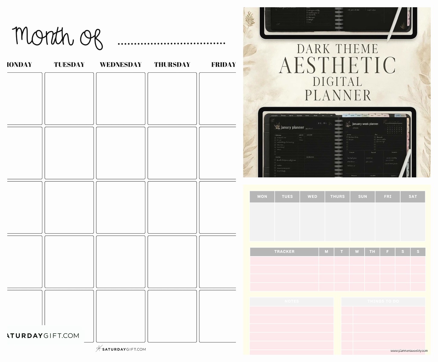
So Good Mondays comes as a PDF file that you download after purchase. It’s designed for iPad with Apple Pencil specifically, though I’ve seen people use it on Android tablets with mixed results. The file size is pretty reasonable, like around 150MB depending on which version you get. They have an undated version and a dated one – I went with undated because commitment issues I guess, but also because I wanted to start mid-year and didn’t wanna waste pages.
The layout is what they call “minimalist” but it’s actually functional minimalist, not that stark white everything minimalist that makes me anxious. There’s enough visual breathing room that you don’t feel overwhelmed, but also enough structure that you’re not just staring at blank pages wondering what to do.
Setting It Up (This Part Matters)
You’re gonna need GoodNotes or Notability. I use GoodNotes 5 and it works perfectly, though I hear GoodNotes 6 has some hyperlink issues sometimes? Haven’t tested that myself. The import process is straightforward – you just download the PDF to your Files app and then open it in GoodNotes.
One thing that confused me at first – the planner has these tabs on the side for navigation and they only work properly if you import it as one file, not split up. I initially tried to separate the months to keep file size down and then all the hyperlinks broke and I spent like 20 minutes trying to figure out what I did wrong while my dog was barking at absolutely nothing outside.
The Hyperlink System
Oh and the hyperlinks are honestly the make-or-break feature here. Every page has these little clickable elements that take you to different sections. There’s a home button, month view button, week view button. Sounds basic but when you’re actually using a digital planner daily, clicking to navigate is SO much faster than scrolling through hundreds of pages.
The monthly calendar pages have hyperlinked dates that jump you directly to that week’s spread. This is huge. I was using another planner before this where I had to manually scroll to find the right week and it was such a small annoyance but it added up to the point where I just stopped using it.
Daily Layout Breakdown
The daily pages are divided into time blocks from 6am to 9pm. Not everyone loves time blocking but I find it helpful for client sessions – I’m a productivity coach so my days are basically back-to-back calls with some admin work squeezed in between. The time blocks aren’t super rigid though, like they’re just there as guides and you can ignore them completely if that’s your style.
Each day has a priorities section at the top, which is just three boxes. Three. Not ten, not a whole scrolling list, just three things. This actually forced me to get real about what I could accomplish in a day, which was annoying at first but now I appreciate it.
There’s also a notes section that’s pretty generous size-wise. I use it for random thoughts, client notes, or sometimes just to vent when a session goes weird. Wait I forgot to mention – there’s a little water tracker and habit tracker on each daily page too. The water tracker is literally just 8 circles you can check off. Super simple but it works? I’ve definitely been drinking more water since I started using this, which wasn’t even a goal I had.
Weekly Spread Situation
The weekly view is where I actually spend most of my time. It’s a horizontal layout with all seven days visible at once, plus a sidebar for weekly goals and notes. This is perfect for when I’m planning out my week on Sunday nights – I can see everything at a glance and move things around if needed.
One thing that’s gonna sound weird but I really like – the Monday column is slightly highlighted. It’s subtle, just a light gray background, but it helps orient you visually. As someone who sometimes loses track of what day it is when I’m deep in work mode, this little detail helps more than it should.
The weekly pages also have a “brain dump” section at the bottom. It’s just blank space but having it labeled as brain dump specifically makes me actually use it. I’ll throw random ideas there, things I need to remember, stuff that doesn’t fit anywhere else.
Monthly Overview Pages
Monthly calendars are clean, grid-style layouts. Each date box is big enough to write in but not so big that the whole month doesn’t fit on one page. There’s a goals section for the month and a notes area. Pretty standard stuff but executed well.
What I appreciate is that the monthly pages come BEFORE the weekly pages in the navigation flow, which matches how I actually plan. I look at the month first, then drill down into weeks, then into days if I need to. Some planners have weird organizational structures that don’t match natural planning flow and it drives me nuts.
Extra Sections That Actually Get Used
There’s a goals section at the beginning with pages for yearly, quarterly, and monthly goals. I’m not huge on long-term goal planning in my planner – I keep that stuff in Notion mostly – but I do use the quarterly pages. Every three months I’ll sit down and map out what I want to focus on for my coaching business, content creation, that kind of thing.
The habit tracker pages are separate from the daily ones, which is nice if you want to see patterns over time. It’s a simple grid where you can list habits down the side and mark off days across the top. I track things like whether I posted on Instagram, did my morning pages, went for a walk. Nothing intense.
Oh and there’s a notes section in the back that’s just blank lined pages with the Good Mondays header. I use these for client session notes mostly, or when I’m reviewing stationery products and need to jot down quick thoughts. Actually that’s what I was doing last Tuesday when my cat decided to walk across my iPad and somehow activated Siri three times.
The Writing Experience
This matters more than you’d think. The paper template they use has a slight texture to it – not like realistic paper texture that some planners overdo, just enough that your Apple Pencil doesn’t feel like it’s sliding on glass. I write with the standard Apple Pencil tip and it feels good. Responsive, no lag, lines appear where you actually put them.
I mostly write in black ink, sometimes dark gray for less important stuff. The planner pages are cream-colored, not stark white, which is easier on my eyes during long planning sessions.
The eraser function works cleanly on these pages. Some digital planners have issues where erasing leaves weird artifacts or doesn’t fully remove ink – this one is fine. You can also use the lasso tool to move text around without any problems.
Stickers and Customization
Good Mondays includes a sticker pack with your purchase. It’s not massive but it’s useful – date tabs, priority flags, little icons for different task types, some decorative elements if that’s your thing. I’m not a heavy sticker user but I do use the priority flags and the little star icons for important deadlines.
You can obviously import your own stickers from other sources too. The planner pages work with any digital stickers you throw at them. I have a collection of productivity-focused stickers I’ve bought from Etsy over the years and they all work fine here.
The color scheme is neutral enough that pretty much any sticker style works aesthetically. Grays, blacks, some muted colors as accents. If you’re into really colorful, rainbow-everything planning, you might find it a bit too subdued. But you can always add color through your own customization.
Templates and Extras
There are some extra template pages included – meal planning, budget tracking, project planning, reading lists. I don’t use most of these regularly but the project planning one is actually solid. It has sections for breaking down project phases, deadlines, notes. I used it when I was planning out a new workshop series and it helped me think through all the components.
The meal planning template is there but I gotta be honest, I never remember to actually plan meals. That’s more of a me problem than a planner problem though.
How It Compares to Other Digital Planners
I’ve tested a bunch of digital planners because that’s literally part of my job, and Good Mondays sits in this nice middle ground. It’s more structured than something like Zinnia or Bloom, which are very artsy and flexible but can feel overwhelming. It’s less rigid than Passion Planner digital, which has a very specific methodology you gotta buy into.
Price-wise it’s around $15-20 depending on sales, which is reasonable. You’re paying once and using it forever, versus subscription planners which I personally don’t love. The value is definitely there.
Compared to Goodnotes’ built-in planner templates, Good Mondays is way more functional. The built-in ones are fine for basic stuff but they don’t have the hyperlink navigation or the thoughtful layout that makes daily use actually pleasant.
Who This Works For
If you want a digital planner that you can actually use for productivity and not just pretty planning that never gets looked at again, this is solid. It’s great for people who have variable schedules, lots of appointments, tasks that need time blocking.
I use it for managing my coaching practice and honestly it’s been better than the paper planner system I was using before. Everything’s in one place, I can search for old notes if I need to reference something from a client session months ago, and I’m not carrying around a physical book everywhere.
It’s also good if you’re planner-curious but don’t wanna commit to an expensive system right away. Twenty bucks is low stakes enough that if you hate it, whatever, but functional enough that you’ll probably actually use it.
Potential Dealbreakers
If you need your planner to go past 9pm regularly, the daily time blocks end at 9 which might feel limiting. I usually just use the notes section for evening stuff but if you want structured time blocking into late night, you’ll have to work around it.
The dated version locks you into specific dates obviously, so if you’re someone who takes breaks from planning or wants to skip around, undated is the way to go. But that means manually writing in dates which some people find annoying.
Also if you’re on Android, I’ve heard mixed things about how well the hyperlinks work in different apps. It’s really optimized for iPad and GoodNotes specifically.
Actual Usage Tips From Three Months In
Set up your tabs in GoodNotes to quick-access your most-used sections. I have tabs for current week, current month, and the notes section. Saves so much time.
Use the lasso tool to create reusable text blocks for recurring tasks. I have my standard coaching session prep checklist saved and I just copy-paste it into whatever day I need it.
The search function in GoodNotes works on handwritten text if your handwriting is decent, which means you can actually find old notes later. This was a game-changer for me with client work.
Don’t feel like you gotta fill in every section every day. Some days I just write my top three priorities and ignore the time blocking. The planner is flexible enough to handle however much or little you wanna engage with it.
If you’re reviewing this for purchase – honestly just grab it next time it’s on sale. The learning curve is minimal, setup takes maybe 10 minutes, and you can start using it immediately. It’s not gonna revolutionize your life or whatever but it’s a really solid tool that does exactly what it says it does, which is more than I can say for a lot of productivity products I test.