Digital Productivity, Online planners, Planners
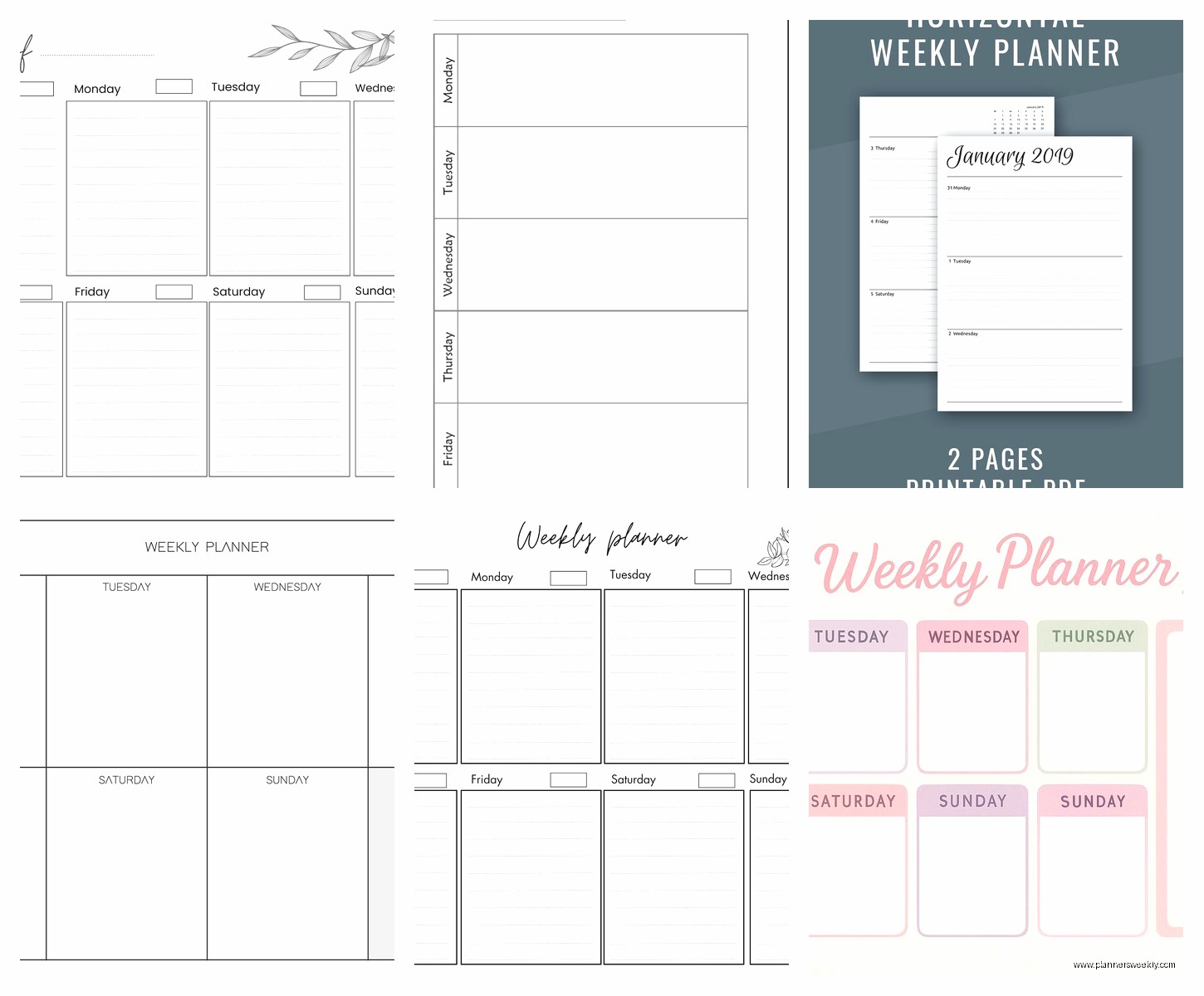
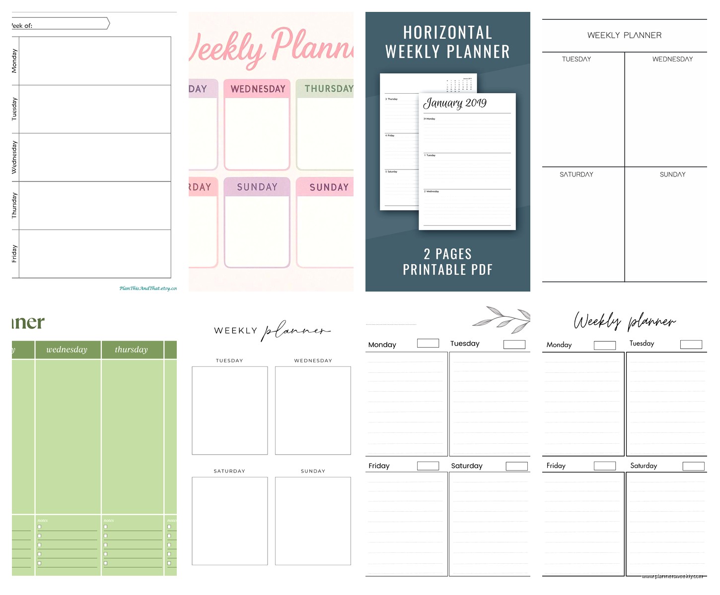
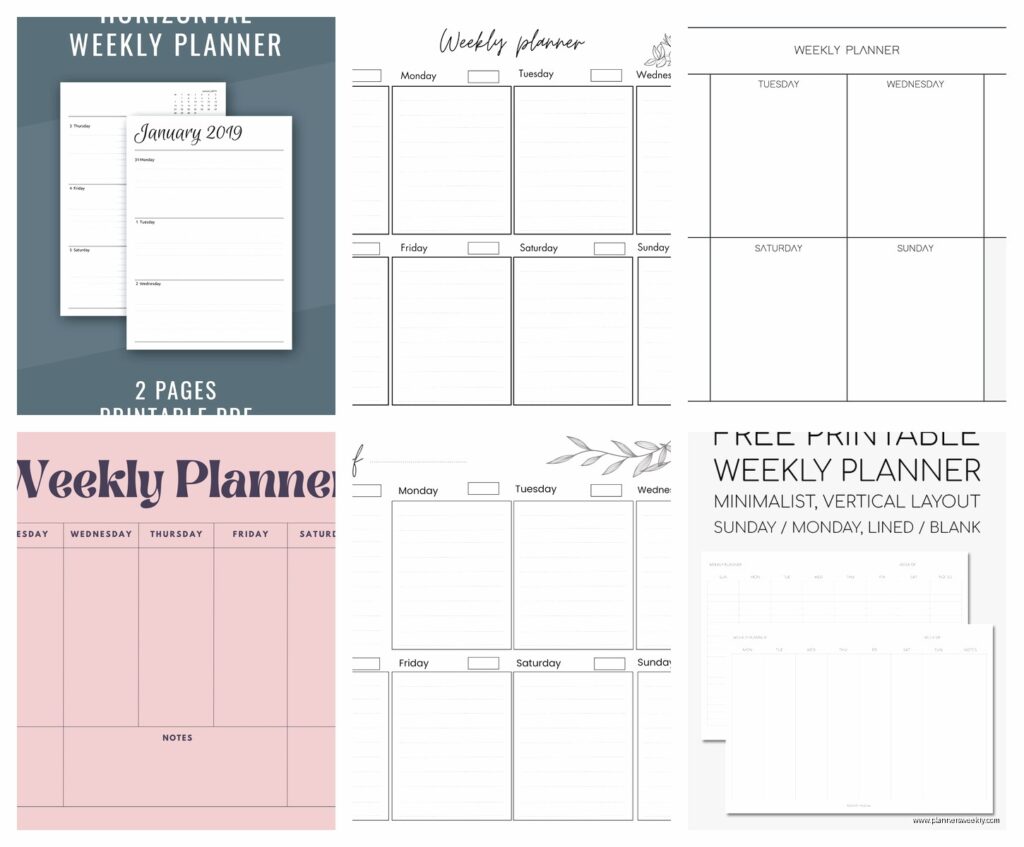
Horizontal Weekly Planner: Best Layout Options & Guide
Apr
Okay so I’ve been testing horizontal weekly planners for like three months now and honestly the layout thing is way more important than I thought it would be. Like I always just grabbed whatever looked pretty but then I’d stop using it after two weeks because the spacing was all wrong for how I actually work.
The main difference you’re gonna notice right away is whether it’s truly horizontal or just rotated. True horizontal means the days run left to right across a two-page spread, so you’ve got Monday through Sunday stretched out in front of you. The rotated ones are basically vertical planners turned sideways and they’re… fine I guess but they don’t give you the same visual sweep of your whole week.
I tested the Leuchtturm1917 horizontal first because everyone raves about it and yeah it’s solid. Each day gets about 2 inches of horizontal space and maybe 6 inches vertically, which sounds tiny but it’s actually enough if you’re not writing full paragraphs for every task. The time blocking sections run from 7am to 8pm which is perfect for me but my friend who works nights hated it. There’s a notes section on the right side of each spread that I initially thought I’d never use but then started filling with random brain dumps and honestly it became my favorite part.
The paper quality is what you’d expect from Leuchttrm – like 80gsm so fountain pens might ghost a bit but ballpoints and gel pens are totally fine. I use Muji 0.38 pens mostly and zero bleed through.
Wait I forgot to mention the Hobonichi Weeks which is technically horizontal but in a completely different format. It’s like pocket-sized, maybe 3.5 x 5 inches, and the weekly pages have these thin columns for each day. Super minimal. Each day is literally just a skinny column with lines and you write tiny or use abbreviations or whatever. There’s no time blocking at all which drove me crazy the first week but then I realized it forces you to prioritize because you literally cannot write everything down.
The Hobonichi paper is Tomoe River which is ridiculously thin but doesn’t bleed. I watched an episode of The Bear while testing different pens on it – even Sharpies don’t bleed through which is kind of insane. But the pages are see-through so you’re always looking at a ghost of the previous week underneath your current week and some people hate that.
Oh and another thing about format – some horizontal planners put the whole week on one page instead of a spread. The Jibun Techo does this and at first I thought it would feel cramped but it’s actually kind of genius? You flip through faster because each week is just one page, and there’s something satisfying about seeing your whole week without having to look left and right across a spread.
The Jibun Techo days are stacked horizontally with little checkboxes next to each time slot. It’s very Japanese-style organized, like almost aggressively structured. I used it during a really chaotic month when I had three product launches and the rigid structure actually helped. But then I tried using it during a slower month and felt suffocated by all those empty boxes staring at me.
This is gonna sound weird but the biggest thing that matters is the actual width of each day column. I measured all of mine because my client canceled one afternoon so I spent an hour comparing them with a ruler like a complete nerd. The Leuchtturm gives you about 2 inches per day. The Hobonichi Weeks is maybe 0.5 inches. The Passion Planner horizontal (which I’ll get to) gives you almost 3 inches per day but it’s huge and heavy.
For time blocking specifically – if that’s your thing – you want actual hourly divisions printed on the page. The Passion Planner has these and they run from 5am to 1am the next day which is excessive but at least it’s there. Each hour gets its own row and you can block out chunks for focus time or whatever. I color-code mine with highlighters after I write everything in pen and it looks very satisfying in a kindergarten craft project kind of way.
The thing nobody tells you about horizontal planners is that they’re wider than vertical ones obviously, so they don’t fit in normal bags as easily. My Leuchtturm is A5 size which is like 5.8 x 8.3 inches and it fits in my work bag but just barely. The Passion Planner horizontal is letter-sized so like 8.5 x 11 and I literally cannot take it anywhere. It lives on my desk permanently.
Okay so funny story – I tried the Moleskine horizontal weekly and returned it after four days. The paper is SO thin and bleedy, like 70gsm maybe? My Pilot G2 pens ghosted through terribly and forget about any highlighters. The layout was fine, similar to Leuchtturm with the days spread across two pages and a notes section, but the paper quality ruined it. I was watching Succession while testing it and got so annoyed I rage-ordered a different planner during the credits.
If you want something more flexible, the Hobonichi Cousin has a horizontal-ish layout that’s actually more like boxes than columns. Each day gets a rectangular box and there’s space for notes at the bottom of each page. It’s an A5 size so portable enough. The Tomoe River paper again which is great. But here’s the thing – it’s expensive, like $45-50 depending on where you buy it, and it’s a full year so if you’re testing out horizontal planning for the first time maybe don’t drop that much.
The budget option I actually really liked is the Blue Sky horizontal planner. It’s like $15 at Target and the paper is decent, maybe 75gsm. Days run across two pages, there’s a notes section, and it has monthly spreads too. The binding is twin-wire which I normally hate because it catches on stuff in my bag but this one lays flat really well. I used it for two months and only switched because I wanted fountain pen friendly paper.
For layout customization – and this matters if you’re picky like me – check whether the days have equal space or if Saturday/Sunday are condensed. Some planners give weekend days like half the space of weekdays which makes sense if you only plan work stuff but is annoying if you’re busy on weekends. The Leuchtturm does equal spacing. The Blue Sky condenses weekends. The Passion Planner does equal spacing but adds a “good things that happened this week” section at the bottom which is nice in theory but I literally never filled it out.
Time blocking variations – some planners have actual printed times (7am, 8am, 9am, etc) and some just have blank lines you’re supposed to label yourself. I thought I’d prefer the blank lines for flexibility but I kept forgetting to label them and then I couldn’t remember what time things were. So now I only buy planners with pre-printed times even though it feels more restrictive.
The Academic Planner from AT-A-GLANCE has a horizontal weekly layout that’s specifically designed for teachers and it runs from August to July. Each day has time slots from 7am to 6pm and then a section called “priorities” at the top. I tested this even though I’m not a teacher because the layout looked good. It’s fine – the paper is just okay, nothing special, and the binding is sewn which is durable. But the priority section at the top of each day is actually really useful? Like you write your top 3 things before you start time blocking and it helps you not overscheduled yourself.
Oh wait, margin space is something I didn’t think about until I started actually using these. Some horizontal planners have basically no margins so you’re writing right up to the edge of the page, and some have like a quarter inch margin all around. The margin space is where I naturally started drawing arrows and brackets to connect related tasks across days, so now I specifically look for planners with decent margins. The Hobonichi Cousin has good margins. The Blue Sky has almost none.
If you use stickers or washi tape – the Leuchtturm and Hobonichi papers are smooth enough that stickers stick well and peel off cleanly if you mess up. The Passion Planner paper is slightly textured and stickers sometimes don’t stick great in the corners. My cat knocked over my coffee while I was decorating a spread once and the stickers basically slid right off the wet paper so that’s something to consider I guess.
For people who like to see their whole month at a glance, some horizontal weekly planners include monthly calendar pages at the front of each month. The Leuchtturm does this. The Hobonichi Weeks does this. The basic Blue Sky does NOT which was annoying because I kept having to flip back to my phone calendar to see what day of the week things were landing on.
Undated versus dated is a whole other decision. Undated means you write in the dates yourself which gives you flexibility to skip weeks or start any time of year, but it’s extra work every single week and I found myself procrastinating on setting up the next week. Dated planners are ready to go but if you skip a week those pages just sit there blank and judging you.
The Ink+Volt horizontal planner is undated and has a really nice layout with each day getting a generous column, plus goal-setting pages at the beginning of each month. The paper is thick, like 100gsm, so it handles everything including watercolor brush pens which I tested because why not. But having to write in the dates every week got old after about a month. I used it during November and December last year and just… stopped setting it up in January.
For minimalists the Hobonichi Weeks is probably your best bet because it’s so stripped down. For people who want structure and prompts, the Passion Planner has the most built-in stuff like inspirational quotes (which I ignore) and reflection questions (which I also ignore) and goal breakdowns (which I sometimes use).
The binding type actually matters more than I thought. Spiral bound lays flat but catches on stuff. Sewn binding is durable but sometimes doesn’t lay completely flat when it’s new. Disc-bound systems like Arc or Levenger let you rearrange pages but they’re expensive and the discs are bulky.
One thing I started doing is using two horizontal planners – a small portable one (Hobonichi Weeks) for when I’m out and a larger desk one (Leuchtturm) for detailed planning at home. Then I transcribe between them which sounds inefficient but actually helps me process my schedule better. I got this idea from a productivity video I watched at like 2am one night and thought it was dumb but then tried it anyway and it kinda works.
The weekly layout should match how you actually think about your time. If you think in terms of morning/afternoon/evening, look for planners that have those divisions marked. If you think in hourly chunks, get one with hourly time blocking. If you just need to dump tasks somewhere and don’t care about specific times, the Hobonichi Weeks style columns are probably enough.
Paper color matters too – most are white or cream. The cream/ivory paper is supposedly easier on the eyes but I haven’t noticed a difference. The Hobonichi paper is slightly cream. Leuchtturm is bright white. Blue Sky is white.
For people who plan both work and personal stuff, having a notes section or separate column is really helpful. I write work stuff in the time blocks and personal stuff in the notes section. Or sometimes I use the notes section for meal planning. Or sometimes it’s just random thoughts. The flexibility is good.