Digital Productivity, Online planners, Planners
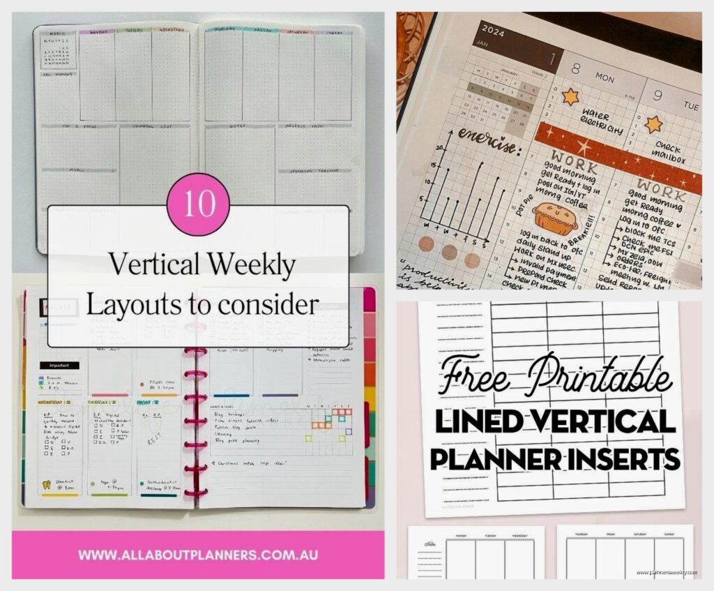
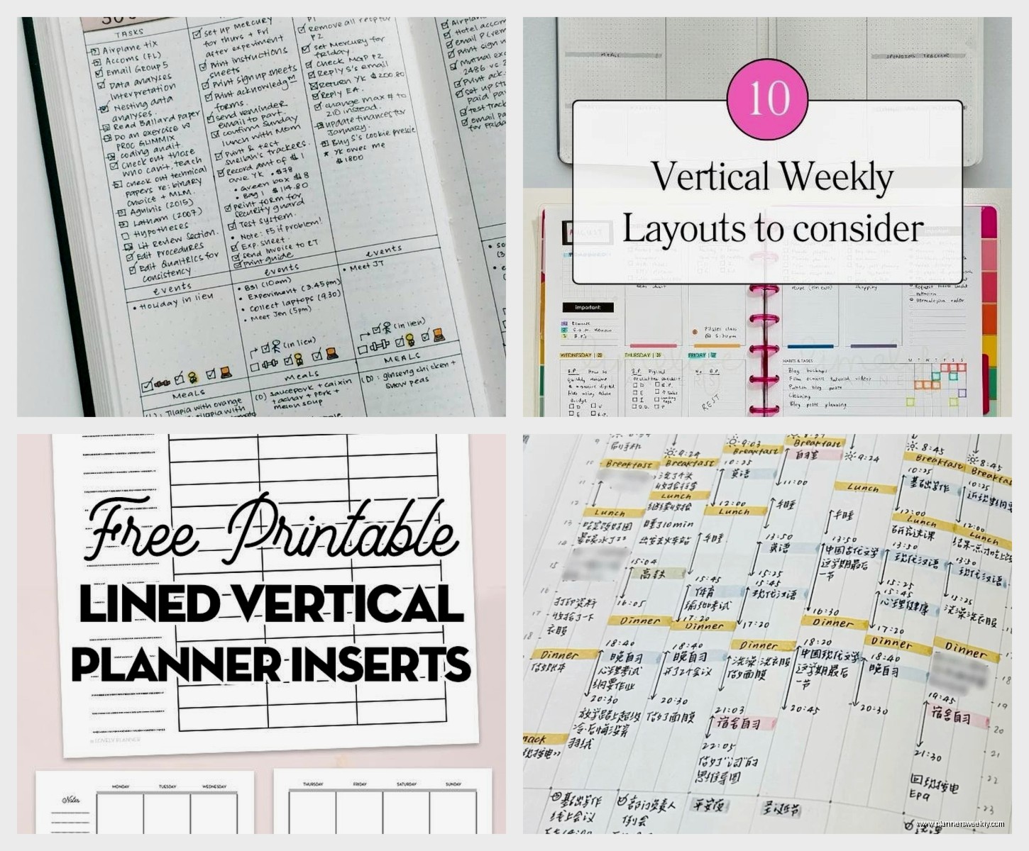
Vertical Planner Guide: Best Options & Layout Benefits
Apr
Okay so I just reorganized my entire planner system last month and vertical planners are honestly where it’s at if you’ve been struggling with the traditional horizontal boxes. Let me break down what actually works because I’ve tested like six different brands at this point.
The Vertical Layout Thing Everyone Talks About
So the main difference is instead of your day being split into these wide horizontal rows, everything runs in columns from top to bottom. Picture three or four narrow columns side by side, each one representing a different time block or category. The Erin Condren LifePlanner popularized this format and honestly I was skeptical at first because I’m that person who needs to see everything spread out, but turns out vertical layouts are actually better for people who schedule in time blocks or need to separate work/personal/whatever.
The way it works is you get more writing space per time slot because you’re working with the full height of the page instead of cramming everything into short horizontal strips. My morning routine used to get squeezed into this tiny 7-9am box in my old planner and now I can actually list out each task without my handwriting turning microscopic.
Best Vertical Planners I’ve Actually Used
Erin Condren LifePlanner
This is the one everyone mentions and yeah it’s pricey at around $60-70 but here’s the deal. The customization options are insane. You pick your cover design, layout style, and they have this thing called “colorful” vs “neutral” interiors. I went with neutral because the colorful one gave me sensory overload honestly, my dog knocked over my coffee while I was trying to photograph it for the blog and I just… anyway.
The vertical layout comes in hourly or blank columns. Hourly is good if you’re scheduling meetings all day, blank is better for task batching. Each day gets divided into morning, afternoon, and evening sections with little checkboxes at the top for habits. The paper quality is really good, like 80lb weight so my Mildliners don’t bleed through.
Downsides though – it’s coil bound which some people hate because it doesn’t lay flat in your bag, and the customization process takes forever if you’re indecisive like me. Took me three days to pick a cover design.
Plum Paper Planner
Wait I forgot to mention this one is cheaper than Erin Condren, usually around $40-50, and the customization is actually MORE detailed which sounds good but can be overwhelming. You can pick different layouts for each month if you want, add extra pages, choose your start month, all that stuff.
Their vertical layout is similar but the columns are slightly wider which I prefer for writing. They also have these tabs on the side of each month that make navigation easier. The paper is 70lb so slightly thinner than EC but still handles most pens fine. I had some ghosting with my Tombow dual brush pens but regular gel pens and markers were totally fine.
The binding options include coil or spiral which is nice, and they have this feature where you can add your own photos to the cover. I put a picture of my workspace on mine and my client saw it during a Zoom call and ordered one immediately so that was funny.
Passion Planner
Okay so this one is different because it’s not purely vertical, it’s more like a hybrid. The daily layout has time slots running vertically on the left side from 6am to 2am (yes, 2am, for all you night owls), and then a blank column on the right for notes or tasks. It’s around $35 which is more reasonable.
What I actually love about this one is the monthly reflection pages and the roadmap section at the beginning where you plan out your goals. Very goal-oriented design. The paper is cream colored instead of white which is easier on my eyes during long planning sessions, and it’s thick enough that my fountain pens don’t bleed.
The main issue is it’s pretty structured, so if you want more freedom in how you use your space, this might feel restrictive. But if you’re someone who needs that structure to actually use your planner, it’s perfect.
BlueSky Vertical Planner
This is gonna sound weird but this is actually my recommendation for people who wanna try vertical layouts without spending a ton. It’s like $20-25 at Target or Amazon, and while it’s not customizable at all, the layout is solid. Three vertical columns per day, decent paper quality for the price.
I use this one for my blog content calendar because I don’t need anything fancy for that, just functional space to write. The binding is twin-wire which lays completely flat, and it comes with stickers which… I don’t use stickers personally but they’re there if you’re into that.
The catch is the paper is thinner so darker pens will show through. Stick with ballpoint or fine tip gel pens and you’re good.
Layout Benefits You’ll Actually Notice
Time Blocking Becomes Easier
The vertical format naturally encourages you to think in time blocks instead of just making lists. Each column can represent a different chunk of your day. I use mine as morning/midday/evening, but you could do work/personal/side project or however you wanna divide it.
What changed for me is I stopped overbooking myself because you can literally see how much vertical space each task takes up. If your morning column is completely full, you know you can’t add more stuff there. It’s visual in a way horizontal planners never were for me.
Better for Multiple Categories
If you’re juggling different areas of life, vertical layouts let you separate them without needing multiple planners. One column for work, one for home stuff, one for personal projects. Everything’s visible at once instead of scattered across different pages.
My productivity coaching clients who switch to vertical formats usually report better work-life boundaries because they can physically see when work is bleeding into personal time. The visual separation helps with mental separation too.
More Writing Space Per Entry
This might seem obvious but it’s the biggest practical benefit. You get the full height of the page for each time slot or category, so you can actually write details instead of cryptic abbreviations you won’t remember later.
I used to write things like “client call” and then forget which client or what we were supposed to discuss. Now I have room to write “Sarah – Q1 planning review, bring spreadsheet, ask about budget approval” all in one entry.
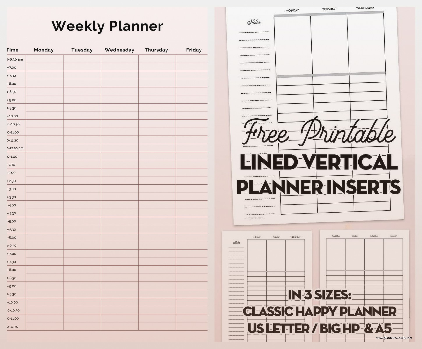
Choosing Between Hourly vs Blank Columns
Okay so this is where people get stuck when ordering. Hourly layouts have time stamps printed down the side of each column, usually starting at 6am or 7am. Blank columns are just empty vertical spaces with no pre-printed times.
Get hourly if you schedule a lot of appointments, meetings, or time-specific tasks. If your day revolves around calendar blocks, the printed times help you stay on schedule. I use hourly for my main planner because I’m scheduling client calls and need to see exactly when things are happening.
Get blank if you work in tasks rather than time slots, or if your schedule varies too much day to day. Creative work, project-based work, or flexible schedules work better with blank columns. My friend who’s a freelance designer uses blank columns and just divides her day into “focus work,” “admin,” and “client stuff” without specific times.
Or Get Both
Some planners like Plum Paper let you mix and match. You could do hourly on weekdays and blank on weekends. I tested this for a month and it was actually really nice – structure during the work week, flexibility on weekends when my schedule is less predictable.
What Didn’t Work For Me
The Happy Planner has a vertical layout option but the disc binding system drives me nuts. The discs are chunky and catch on everything in my bag. I know some people love the ability to move pages around but I found it more annoying than useful. Pages would randomly fall out and I lost an entire week once, so… yeah.
Also tried some cheaper Amazon vertical planners that shall remain nameless and the paper quality was terrible. Ink bled everywhere and the binding fell apart after two months. Sometimes the extra $20-30 for a quality planner is worth it if you’re using it daily.
Oh and another thing – really elaborate vertical planners with tons of sections per day can be overwhelming. I tested one that had like six tiny columns per day plus a sidebar for notes and it was just too much. Sometimes simpler is better, you don’t need a different column for every tiny category of your life.
Actually Using Your Vertical Planner
The layout doesn’t matter if you don’t have a system for using it. What works for me is assigning each column a specific purpose and sticking with it. Left column is always time-sensitive stuff, middle is tasks for that day, right is notes or ideas that come up.
Color coding helps too but don’t go overboard. I use three highlighters max – one for work, one for personal, one for urgent stuff. More than that and you spend more time deciding which color to use than actually planning.
Weekly reviews are huge with vertical planners because you can see patterns more easily. If your work column is consistently overflowing, that’s data telling you something about your workload. The visual nature of vertical layouts makes these patterns more obvious.
Digital vs Paper Vertical Planning
Wait I should mention digital options because people always ask. GoodNotes and Notability both have vertical planner templates you can buy. I tested these for about six weeks while my cat was recovering from surgery and I was home more, had the iPad right there…
Digital vertical planning works great if you’re already in the Apple ecosystem and comfortable with stylus writing. The advantage is infinite space – your columns can scroll forever if needed. You can also copy/paste recurring tasks which saves time.
But honestly I went back to paper because the tactile experience helps me remember things better, and I don’t get distracted by notifications when I’m planning. Your mileage may vary though, especially if you’re someone who has their tablet with them more than a physical planner.
The Real Question: Will You Actually Use It
The best vertical planner is the one you’ll consistently open and write in. If you’re attracted to the aesthetic of Erin Condren but the price makes you nervous about “wasting” it, start with BlueSky or Passion Planner. If customization excites you rather than overwhelms you, Plum Paper is worth the time investment.
I’ve been using vertical layouts exclusively for about eight months now and I’m not switching back. The way information is organized just makes more sense for how my brain works. But I also know people who tried it and immediately returned to horizontal layouts because they felt too constrained by the columns.
Test it out with a cheaper option first if you’re unsure, or look for planners with sample pages online so you can see exactly what the layout looks like before committing. Most brands have PDF downloads of sample pages on their websites.