Digital Productivity, Online planners, Planners
At a Glance Weekly Planner: Complete Guide & Reviews

Mar
Okay so I’ve been testing At a Glance weekly planners for like three months now
So here’s the deal with At a Glance weekly planners – they’re actually way more varied than you’d think and honestly I didn’t realize this until my client canceled last Tuesday and I spent two hours in Target just comparing the different versions because I’m apparently that person now.
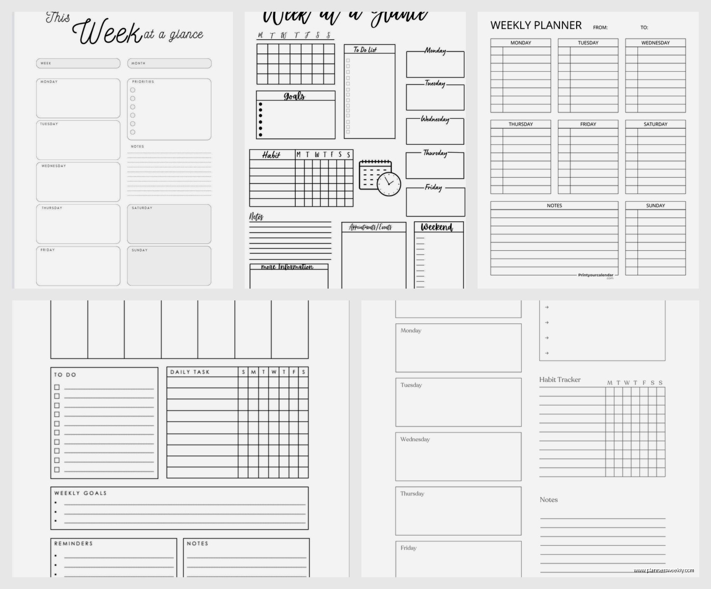
The main thing you gotta know is At a Glance makes like a dozen different weekly planner formats and they’re NOT all the same. The most popular one is their Academic Weekly/Monthly planner which runs from July to June, and then there’s the regular calendar year version. I’ve been using both depending on which clients I’m working with and the academic one is honestly better even if you’re not in school because the July start gives you this weird psychological fresh start in summer.
The layout situation is where it gets interesting
Their standard weekly layout has Monday through Sunday running vertically down the left side with like a 2-inch column for each day. Then there’s this notes section on the right that’s supposedly for tasks but I always end up doodling there or writing random thoughts. The paper quality is… okay it’s not amazing but it’s not terrible? Like a 6 out of 10. I use Pilot G2 pens mostly and there’s minimal bleed-through but if you’re using gel pens or anything wet, you might see some ghosting on the back.
Wait I forgot to mention – the size matters SO much here. They make these in like five different sizes and I tested the 8.5 x 11 hardcover, the 5 x 8 compact, and this weird 6 x 9 size that’s actually my favorite now. The 8.5 x 11 feels very professional and corporate, stays open flat on your desk which is great, but it’s heavy. Like I threw out my shoulder bag heavy if you’re carrying it around all day.
The compact version is where I started
The 5 x 8 compact seemed perfect at first because it fits in my purse and I could take it everywhere. But then after like two weeks I realized the writing space per day is maybe 1.5 inches? So if you have more than like three things happening that day you’re either writing microscopic or abbreviating everything. My Wednesdays were always a disaster because that’s my coaching day and I’d have six sessions plus errands and it just became this cramped mess.
Oh and another thing – some versions have this weird fake leather cover that feels kinda cheap but actually holds up really well. I spilled coffee on mine (of course) and it just wiped right off. The hardcover versions with the actual bookbound binding are sturdier but more expensive, usually like $15-20 versus $8-12 for the wirebound.
The wirebound ones are actually my preference now because you can fold them completely back and they lay flat either way. The twin-wire binding At a Glance uses is pretty sturdy – I haven’t had one break yet and I’m not gentle with my planners. I’m the person who shoves them in bags with pens uncapped and water bottles that definitely leak.
Lets talk about the monthly view situation
So every At a Glance weekly planner also has monthly calendars, usually at the front of each month. These are… fine. They’re basic grid layouts with smallish boxes, maybe 1 inch squares. Good for seeing the big picture and blocking out travel or deadlines but not detailed enough for actual planning. I use them mostly for marking paydays and when quarterly taxes are due and that’s about it.
This is gonna sound weird but the monthly pages are actually better quality paper than the weekly pages? I noticed this when I was comparing them side by side and the monthly sheets are slightly thicker. No idea why. Maybe because people reference them more so they need to hold up better.
The different collections they make
At a Glance has these different design lines and they’re priced differently which is annoying. The basic “Professional” line is the cheapest and honestly works fine for most people. Solid colors, nothing fancy, gets the job done. Then there’s the “Signature Collection” which has prettier covers with patterns and metallics and costs like $5 more for literally the same interior.
I bought one of the Signature ones in this teal geometric pattern because it was pretty and I’m weak for stationery, but functionally it’s identical to my boring black Professional one. The paper is the same, layout is the same, everything. You’re just paying for the aesthetic which, fair, sometimes that matters for motivation.
They also make this “Elevation” line that has perforated corners on each page which is supposed to make it easier to find your current week. In practice I never use this feature and the perforations make the pages feel flimsier. Skip that line unless you really love that specific feature.
What actually works for different types of people
Okay so if you’re someone with a pretty consistent schedule – like you work regular hours, have standing appointments, that kind of thing – the standard vertical weekly layout is perfect. You can block out work hours, see your whole week at once, and the notes section works for your running task list.
But if you’re more like me with a chaotic schedule that changes daily, the hourly weekly planner version is way better. At a Glance makes one that has Monday through Friday with hourly time slots from 8am to 6pm, then a separate column for Saturday and Sunday. This one saved my sanity honestly because I can block out client sessions, see gaps for admin work, and actually know when I’m free.
The hourly one I use is the “Executive” version and it’s wirebound, 8 x 11, runs about $18. Worth it if you need time blocking. The only annoying part is weekends get less space but I usually have less going on then anyway so whatever.
Paper quality real talk
I mentioned this before but it’s worth expanding on – the paper is okay but not great. It’s that slightly off-white cream color that’s supposed to reduce eye strain or whatever. It’s 20lb weight I think, which is standard for planners but thinner than I’d prefer. My Tombow dual brush pens bleed through completely so I can’t use those for headers anymore, which was sad because I had this whole color coding system going.
Regular ballpoint pens, gel pens like Pilot G2 or Pentel Energel, fine tip Sharpie pens – all of these work fine with minimal ghosting. Highlighters are hit or miss. The Zebra Mildliners work okay, but regular fluorescent highlighters sometimes bleed. I tested this extensively one afternoon when my dog was at the vet and I was stress-highlighting everything.
Wait I forgot to mention the extras
Most At a Glance planners come with like reference pages in the back – future planning pages for the next year, a contacts section, notes pages. I never use the contacts section because who writes phone numbers down anymore, but the notes pages are actually useful. There’s usually like 10-15 pages of just blank lined paper which I use for meeting notes or brainstorming.
Some versions have stickers included which feels very 2015 but they’re actually decent quality. Little stars and checkmarks and “important” flags. I gave mine to my friend’s kid but if you like that kind of thing they’re there.
The academic year versions have better deals
Okay so funny story – I discovered that the academic planners go on clearance in like September/October at most stores because new stock comes in July. So if you don’t mind starting your planner mid-year, you can get them for like 50% off. I bought three At a Glance academic planners last October for $6 each and just started using them in January, crossing out the July-December months I missed. Worked perfectly fine.
The academic versions also tend to have more color options and design choices because they’re marketed to students. So if you want something that’s not just black or navy, check the academic section.
How they compare to other brands quickly
Since you’re probably wondering – At a Glance is cheaper than Plum Paper or Erin Condren but better quality than the random Amazon basics planners. Blue Sky planners have prettier designs but worse paper quality. Moleskine weekly planners are way more expensive and honestly not better enough to justify the price. Passion Planner has better layouts if you’re into that productivity goal-setting thing, but At a Glance is more straightforward and less… intense? Less pressure to optimize your entire life.
For basic weekly planning that works and doesn’t cost a fortune, At a Glance is solid. They’re available everywhere – Target, Walmart, Amazon, office supply stores. Easy to replace if you lose one or want to switch mid-year.
The specific ones I actually recommend
If you need me to just tell you which one to buy, here’s what I’d get depending on your situation:
- Busy schedule with lots of appointments: At a Glance Executive Weekly/Monthly Appointment Book with hourly slots, 8 x 11, wirebound
- Regular schedule, want something portable: At a Glance Professional Weekly/Monthly Planner, 6 x 9, any binding
- Student or teacher: At a Glance Academic Weekly/Monthly Planner, any size, get it on clearance in fall
- Just need basic planning: At a Glance Professional Weekly/Monthly, 5 x 8 compact if you carry it, 8.5 x 11 if it stays on your desk
The 6 x 9 size is the sweet spot for most people though. Big enough to actually write in, small enough to transport. That’s what I’m using now and probably will stick with unless they discontinue it which would be devastating.
Things that annoyed me after extended use
The wirebound versions eventually get those little wire pieces that stick out and snag on stuff. This happened to mine after like four months of daily use. You can push them back down with pliers but it’s annoying.
The elastic band closure some versions have stretches out really fast. Mine became useless after maybe six weeks. Now it just flops around decoratively.
The bookmark ribbon is too short on most versions. It barely reaches the bottom of the page so you gotta really tuck it in there to mark your spot properly.
Some of the covers scratch easily, especially the glossy ones. My teal geometric one looks kind of beat up now and I’ve only had it since January. The matte finish covers hold up better.
Random tips from actually using these
I put washi tape tabs on the first page of each month so I can flip to them faster. The little monthly tabs they include are too small and I always lose my place.
The first week of using any new planner I just write everything down, even stuff I’d normally remember, to build the habit. Otherwise I forget to check it and it becomes a fancy notebook.
I keep mine open on my desk all week to the current week spread. If I close it I forget about it. Just leaving it open where I can see it makes me actually use it.
For the hourly versions, I draw a line across the page at 5pm to separate work stuff from evening stuff. Helps me actually stop working at a reasonable time instead of letting tasks bleed into night.
Oh and I date the spine with a silver Sharpie so when I archive old planners I can find specific months later. Saved me when I needed to reference what I was doing last April for a client project.
So yeah that’s basically everything I’ve learned from testing these things way too thoroughly. The At a Glance weekly planners are solid, affordable, functional planners that do what they’re supposed to do without being fancy or expensive. Get the hourly one if you need time blocking, get the 6 x 9 size unless you have specific reasons not to, and maybe wait for a sale because they go on clearance pretty regularly.