Digital Productivity, Online planners, Planners
Custom Daily Calendar: Create Your Perfect Planner
Mar
Okay so I’ve been deep in the custom daily calendar rabbit hole for like three months now and honestly it started because my regular planner just wasn’t cutting it anymore. I had this beautiful pre-made one but I kept leaving sections blank and running out of space in others, which felt so wasteful.
Figure Out What You Actually Need First
Here’s the thing nobody tells you – don’t start designing until you track yourself for like a week. I know that sounds backwards but trust me. I grabbed a blank notebook and just wrote down everything I needed to reference or track throughout my day for seven days straight. Meetings, sure, but also when I took my vitamins, random ideas that popped up during client calls, how much water I drank because apparently I’m supposed to care about that now.
The results were honestly embarrassing. I thought I needed huge todo list sections but turned out I was only writing like 3-5 tasks per day max. Meanwhile I had zero space for tracking my actual energy levels which would’ve been way more useful for scheduling calls.
The Three Main Approaches I’ve Tested
So you’ve basically got three routes here and they all have weird pros and cons that nobody mentions in those aesthetic planner videos.
Digital Custom Templates
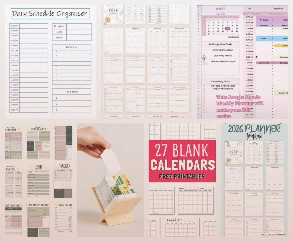
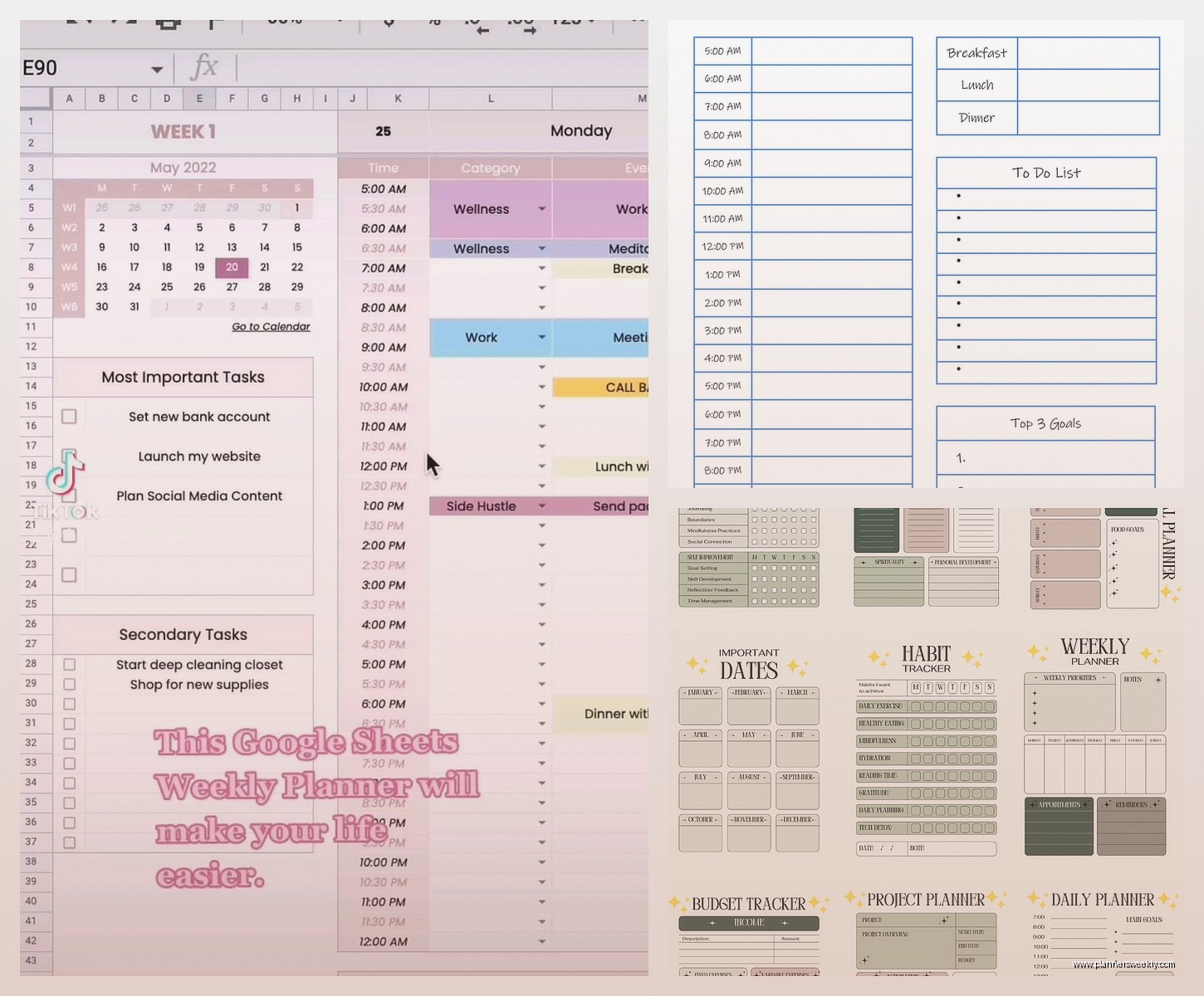
I started with Canva because everyone says it’s easy and yeah it is but also you’re gonna spend two hours just looking at fonts. The free version gives you enough to work with though. What I did was create a template that’s 8.5×11 because that’s standard printer size and I wasn’t about to pay for custom cutting yet.
My template has the date at the top obviously, then I split the page into three columns. Left column is time-blocked schedule from 7am to 8pm in one-hour chunks. Middle is my priority tasks section which I keep to just five lines because otherwise I go crazy and add seventeen things. Right column is notes slash random thoughts because my brain doesn’t stop.
Oh and another thing – I added a tiny habit tracker at the bottom with just four boxes. Vitamins, movement, reading, and one wildcard that changes monthly. More than four and I just ignore the whole thing.
The annoying part about digital is you gotta print it every week or month depending on your setup. I batch print now on Sundays while watching whatever true crime thing I’m into. Uses way less ink than you’d think if you keep it minimal.
Bound Custom Planners from Print Services
Wait I forgot to mention – if you want something that feels more official, places like Artifact Uprising or even Mixbook let you create actual bound planners. I tried this for Q4 last year and the quality was actually really good.
You design your pages in their system which is less flexible than Canva but also means you can’t spend three hours moving a text box two pixels. They print and bind it and ship it to you. Takes about two weeks usually.
Cost me like forty-five bucks for three months of daily pages plus some monthly overview pages. Not cheap but also I was spending thirty on planners I didn’t fully use so the math kinda worked out. The binding held up great even though I’m rough with my stuff. Dropped it in coffee once and it survived which my cat found very disappointing since she was hoping for drama.
The trick here is you gotta commit to the layout before you order. I changed my mind about wanting a gratitude section halfway through November and just had to ignore that space for six weeks. Learned that lesson.
Disc-Bound DIY System
This is gonna sound weird but this ended up being my actual daily driver. Got one of those Arc punch systems from Staples – the punch itself is like twenty-five bucks and then the discs and covers are separate. But here’s why it works.
I design my pages in Google Docs now instead of Canva because I can just quickly adjust things. Keep a master template, duplicate it, print whatever I need. Punch the pages and add them to my notebook. If I decide I hate a layout I just remove those pages and print new ones. It’s so much less precious than a bound book.
My current daily page is honestly super simple now. Date and day of the week at top. A priorities box that fits exactly three items because that’s realistic. Then I have hourly time blocks from 9am to 6pm only because I stopped pretending I’d plan my whole day from wake-up. Below that is a notes section and a small box for tomorrow’s prep where I write like three things to set up.
Oh and I added a mood check-in thing with just three faces – good, meh, rough. Takes two seconds to circle one and it’s actually been super helpful for noticing patterns. Like I feel rough every Wednesday apparently and I still don’t know why.
What Actually Goes On Your Pages
So this is where people get too extra. I’ve tested like fifteen different section types and most are useless.
Time blocking works if you actually have a schedule. If your days are unpredictable maybe skip it. I use 30-minute increments not 15 because I’m not a surgeon and don’t need that precision. Some people swear by 15-minute blocks but that made me anxious.
A top three priorities section is genuinely helpful. Not top five, not top ten. Three things that if you did them the day was successful. Everything else is bonus. I put this at the very top of my page so I see it first.
Water tracking – okay I resisted this for so long because it felt silly but then I added eight little circles and it actually helped me drink more water. Each circle is one glass. Super basic but it works.
Meal planning section if you’re into that. I’m not really so I just have a small box that says “food notes” where I write if I need to defrost something or remember to eat lunch because sometimes I forget when I’m deep in work.
What I skip now – gratitude journaling on my daily pages. It’s not that I’m against it but I never actually filled it out daily and the blank space made me feel guilty. Same with exercise tracking in detail, weather tracking, inspirational quotes, all that stuff. If you’ll actually use it cool but be honest with yourself.
The Technical Setup Stuff
Margins matter more than you think. I keep mine at 0.5 inches all around minimum or your text gets cut off when printing. Learned that the hard way when my first batch came out with chopped-off task lists.
For fonts just pick two maximum. One for headers and one for body text. I use Montserrat for headers and Lato for everything else because they’re clean and print clearly. Tried some fancy script fonts once and couldn’t read my own printed pages.
If you’re printing at home invest in decent paper. I use 28lb paper instead of regular 20lb and it makes such a difference. Doesn’t feel flimsy and the ink doesn’t bleed through as much. Costs maybe three dollars more per ream.
Color versus black and white – I do black and white now with just one accent color for headers. Saves ink and honestly looks cleaner. My full-color phase lasted two weeks before my printer started crying.
Actually Using The Thing You Made
This is where it gets real. I’ve created beautiful custom planners that I used for three days and then abandoned. The trick is making it so easy to use that you can’t not use it.
Keep it visible. Mine sits open on my desk always. Not in a drawer, not closed on a shelf. Open to today’s page. If I have to hunt for it I won’t use it.
Fill it out at the same time every day. I do mine at 8:30am with my coffee. Takes maybe five minutes to write my three priorities and block out my calls for the day. That’s it. Evening reviews sound nice but I never stuck with them.
Don’t try to make it perfect. My pages have coffee stains and crossed-out stuff and doodles in the margins. It’s a tool not a museum piece. The Instagram-perfect planners are lying to you or they’re not actually using them for real work.
If a section isn’t working just stop using it. I had a “wins of the day” section for like two months that I filled out maybe four times. Just drew a line through it on my template and moved on. Your planner should adapt to you not the other way around.
Iteration Is The Whole Point
Okay so funny story – I’m on version 11 of my daily page template. Version 1 was chaos with like eight different sections and color coding that required three highlighters. Version 11 is mostly white space with just the essentials and it’s the one I’ve actually stuck with for four months now.
Every month I tweak something small. Added a water tracker in February. Removed the detailed time blocks on weekends in March because I never used them. Changed my font size for the date because I couldn’t read it without my glasses.
The beauty of custom is you’re never locked in. Print a week at a time while you’re figuring it out. Once you hit a layout you like print a month. I finally printed a full quarter this month because my template has been stable.
Also test your layout digitally first if you can. I use GoodNotes on my iPad to fill out a test day before printing. Helps you see if you actually have enough space or if sections are weirdly positioned. Saved me from wasting paper on a layout where the priority box was somehow at the bottom of the page which made zero sense.
The Hybrid Approach That Actually Works
Real talk – my “perfect planner” is actually a mix. I have my custom daily pages in my disc-bound system. But I also keep digital calendar for appointments because my clients book online. And I have a separate monthly overview that I print on 11×17 cardstock because seeing the whole month at once helps my brain.
They work together. Digital calendar is the source of truth for time-specific stuff. Daily pages are for planning my energy and tasks. Monthly overview is for big-picture stuff and tracking project deadlines.
Trying to make one system do everything is how you end up with a seventeen-section daily page that you hate. Different tools for different jobs.
Oh and another thing – I keep a random thoughts notebook totally separate. Just a cheap spiral notebook for brain dumps. My planner is for intentional planning not stream-of-consciousness chaos. That separation really helped me actually use my custom planner instead of it becoming a messy catch-all.
Common Mistakes I Made So You Don’t Have To
Making it too complicated right away. Start minimal and add sections only when you notice you need them. Way easier than starting complex and trying to figure out what to remove.
Designing when I should be planning. Sometimes I’d spend 45 minutes adjusting my template instead of actually using it to plan my day. The template tweaking is procrastination dressed up as productivity.
Not leaving enough writing space. Those cute tiny boxes for tasks don’t fit actual task descriptions. I need at least a half-inch of line height or my handwriting is illegible.
Forgetting about the hole punch. If you’re using a disc-bound or ring system make sure your important content isn’t where the holes go. Put that space on the left margin and keep it clear.
Trying to track too many habits. Four max. Seriously. More than that and you’ll ignore all of them.
Making weekend pages identical to weekday pages. My weekends are totally different so my Saturday and Sunday template is way more relaxed. Just priorities and notes, no time blocking.
The biggest thing is just start somewhere. Print one week of pages with a basic layout and see what happens. You’ll know pretty quickly what’s missing and what’s extra. Then adjust and print another week. After a month you’ll have a way better sense of what your perfect planner actually looks like versus what you think it should look like.