Digital Productivity, Online planners, Planners
Passion Planner Digital: Complete Review & Guide
Apr
Okay so I’ve been using Passion Planner Digital for like three months now
And honestly? I put it off forever because I was perfectly happy with my paper version, but then my bag got caught in a rainstorm and half my weekly spread just… dissolved. So here we are.
First thing you need to know is that Passion Planner Digital works exclusively with GoodNotes on iPad. Like, that’s it. If you’re on Android or you’re a Notability person or whatever, this isn’t gonna work for you. They’re super specific about this and I learned the hard way trying to import it into Noteshelf because I’m stubborn.
The app costs $7.99 which is honestly nothing compared to buying the physical planner every year, and you get lifetime updates. I bought mine in January and they’ve already pushed out two updated versions with new features.
What you actually get when you download it
So the download is chunky. Like, really chunky. The full year file is around 500MB which made my iPad choke a bit during import. What I did instead was download just one quarter at a time, which worked way better. Each quarter is its own PDF and honestly that’s how I’d recommend doing it because scrolling through 365+ pages gets annoying real fast.
Inside you get:
- Monthly calendars with the roadmap section (that’s their whole thing)
- Weekly spreads in both horizontal and vertical layouts
- Daily pages if you’re into that level of detail
- A bunch of worksheets for goal setting and reflection
- Blank dot grid pages
- Lined pages
- Some habit trackers and extras
The monthly roadmap is what Passion Planner is known for. You’ve got your regular calendar grid but then there’s this whole section where you map out personal goals, work goals, and things to focus on. I thought it would feel gimmicky in digital format but it actually translates pretty well.
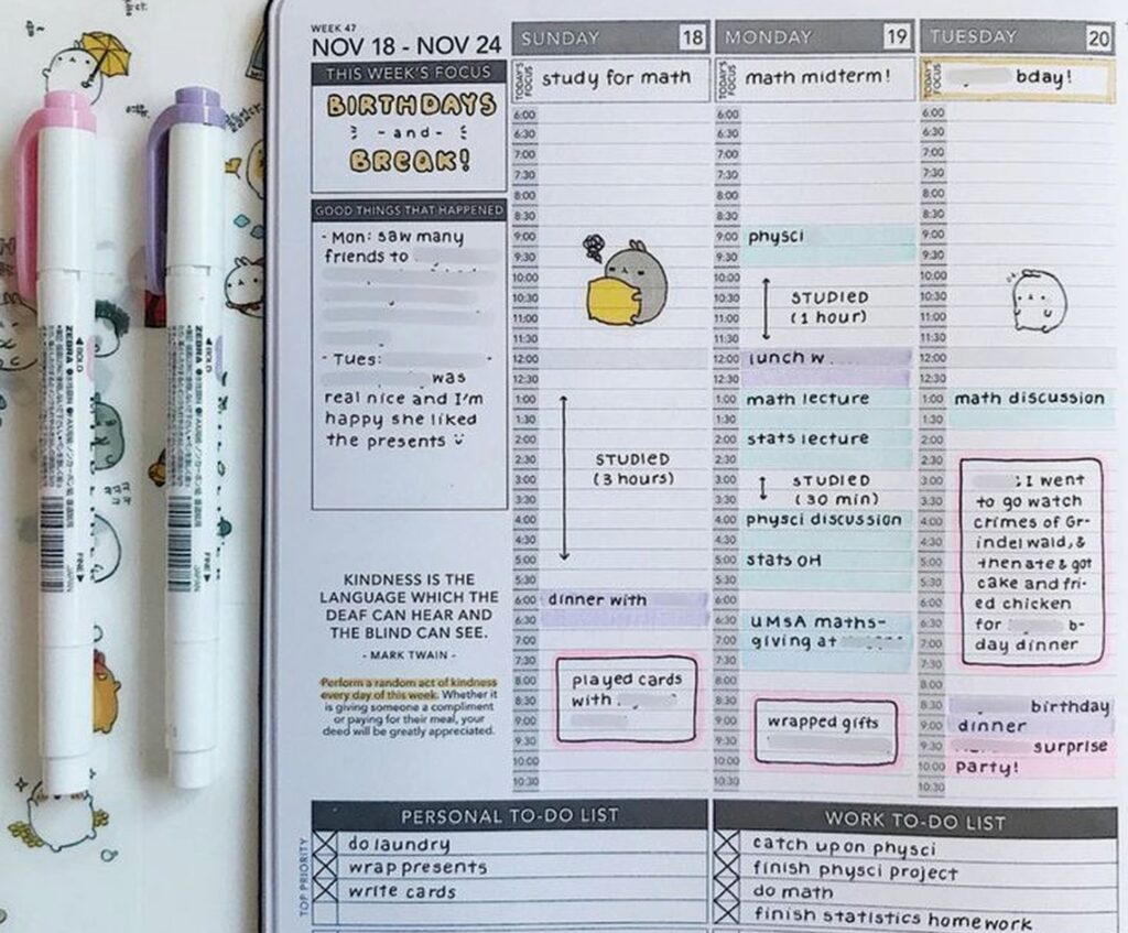
Weekly spreads and how they actually work
This is where I spend like 90% of my time. The weekly layout has your days running vertically with time slots from 7am to 9pm, plus a section for each day’s focus and a good things that happened box. On the side there’s space for your weekly goals and a reflection prompt.
Oh and another thing, the hyperlinks are actually functional. You can tap on any date in the monthly view and it jumps you straight to that week. Then there are little arrow buttons to navigate forward and back. Sounds basic but half the digital planners I’ve tested just give you a flat PDF with zero navigation.
I use the Apple Pencil for everything and the writing experience is smooth. The time slots are spaced well enough that my handwriting doesn’t look completely chaotic. I’ve got messy handwriting on a good day so this matters.

One thing that bugged me initially was that the weekly pages don’t have different background colors or anything to distinguish AM from PM visually. It’s just… one long column. So I started using the highlighter tool in GoodNotes to block out my work hours in a light yellow, which helps me see my day structure at a glance.
Wait I forgot to mention the customization options
When you buy the planner, you pick your start month and whether you want dated or undated pages. I went with dated because I’m lazy and didn’t wanna write the dates in myself every week. But undated gives you more flexibility if you’re someone who takes breaks from planning or whatever.
You also choose between the horizontal or vertical weekly layout. Vertical is the classic Passion Planner style – it’s what I described above. Horizontal has the days going across the page with less hourly detail but more space for tasks and notes. I tested both for a week each and stuck with vertical because I’m very time-block oriented.
The color scheme is neutral – lots of black, white, and grey with occasional muted accent colors. If you’re into super colorful planners this might feel boring. I actually like it because it doesn’t compete with my own color coding system.
The goal setting stuff and whether you’ll actually use it
Okay so Passion Planner is big on their whole reflection and goal-setting philosophy. Every month starts with a roadmap page, every week has prompts, and there are quarterly and yearly review worksheets scattered throughout.
I’m gonna be real with you – I skip most of the prompts. Like, “what am I grateful for this week” is nice and all but when I’m planning my Tuesday I just wanna write down my meetings and move on. But the roadmap pages? Those I actually use.
The monthly roadmap has you break down your goals into categories – usually personal, work, and relationships or whatever makes sense for you. Then throughout the month you can see if your weekly tasks actually align with those bigger goals. It sounds cheesy but it’s genuinely helped me catch myself when I’m spending all my time on busy work that doesn’t matter.
My client canceled last week so I spent an hour actually filling out one of the yearly reflection worksheets just to see what it was like. It asks you to map out your 3-month, 1-year, and 3-year goals with specific action steps. Pretty standard stuff but having it built into the planner where I’m already working made me actually do it instead of just thinking “yeah I should goal set sometime.”
This is gonna sound weird but the blank pages are clutch
There are like 50 blank dot grid pages at the back of each quarter and I use them constantly. Meeting notes, brainstorming, sketching out content calendars, whatever. Having them right there in the same file as my planner means everything stays together.
You can also duplicate pages in GoodNotes which is something I didn’t realize for embarrassingly long. So if you want more blank pages or another copy of a worksheet, you just duplicate it. Game changer.
How it compares to other digital planners
I’ve tested probably 30+ digital planners at this point because apparently that’s what I do with my free time. Passion Planner Digital sits in this middle zone between super minimal planners and the really elaborate ones with a million stickers and widgets.

It’s more structured than something like Noteful or a basic PDF planner. You’re working within their specific layout and system. But it’s way less overwhelming than the Goodnotes template packs on Etsy where you’ve got like 15 different dashboard options and custom widgets and it takes you 20 minutes just to set up one day.
The functionality is solid but not fancy. No interactive checkboxes or anything like that – you’re just writing and checking things off manually. Some people love the interactive elements in other planners but honestly they slow me down.
Price-wise it’s competitive. $7.99 for a year versus buying a $30-35 paper planner. Other digital options range from free (basic PDFs) to like $25 for really elaborate template systems.
The actual workflow and how I use it daily
My routine is pretty simple. I keep the planner open in split screen with whatever else I’m working on. GoodNotes lets you have multiple documents open in tabs which is helpful.
Sunday nights I fill out the weekly spread for the coming week. I write in my set appointments and commitments, block out focus time for projects, and list out my top 3 goals for the week. Takes maybe 15 minutes.
Each morning I look at that day’s column and adjust as needed. Add tasks, move things around, whatever. The lasso tool in GoodNotes makes it easy to move stuff without rewriting everything.
Oh and I keep a running task list on one of the blank pages that I reference throughout the week. Anything that doesn’t fit in a specific day goes there. This is probably inefficient but it works for my brain.
I barely touch the daily pages. They’re there if you want like hour-by-hour detail plus journaling space, but the weekly spread has enough room for me. I tested using the daily pages for one week and it just felt like extra work.
Problems I’ve run into
The file size thing I mentioned earlier. It’s annoying. Even splitting by quarter, scrolling can lag sometimes if you’ve got a lot of other apps running.
No dark mode option. The pages are white background which is fine during the day but at night it’s like staring into the sun. I’ve started using the display settings on my iPad to invert colors when I’m planning before bed but that’s a workaround not a solution.
The time slots end at 9pm which doesn’t work if you’re a night owl or work evening shifts. I’ve just been writing below the printed times when I need to but it looks messy.
You can’t rearrange sections easily. Like if you wanted your habit tracker on the weekly page instead of separate, you’d have to manually copy and paste it every single week. The structure is pretty fixed.
And this is super specific but the reflection prompts are very… earnest? Sometimes I just wanna plan my Wednesday without thinking about my personal growth journey or whatever. But you can ignore them so it’s not a huge deal.
Stuff that surprised me in a good way
The hyperlinks work really well. I thought they’d be glitchy but nope, smooth navigation throughout.
Updates are actually meaningful. The two updates since I bought it added new worksheet templates and fixed some formatting issues. They’re actively maintaining it.
The paper texture background is subtle enough that it doesn’t interfere with writing but makes it feel less sterile than a pure white digital page. Didn’t think I’d care about this but I do.
You can use it across multiple devices if you have GoodNotes syncing through iCloud. I mostly use my iPad but sometimes I’ll pull it up on my iPhone to check what’s on my schedule. The phone screen is tiny for actual planning but fine for reference.
Who this is actually good for
If you already like the Passion Planner system in paper form, the digital version is a solid transition. The layout and philosophy are identical, you’re just writing on a screen instead of paper.
If you’re someone who wants structure but not like… intense structure. It guides you but doesn’t force you into a specific productivity method.
If you’ve got an iPad and Apple Pencil already. That’s non-negotiable for this to work properly.
If you like having everything in one place – planning, notes, goal tracking, random thoughts. The all-in-one aspect is convenient.
Who should probably skip it
If you’re on Android or don’t have an iPad, obviously. The GoodNotes requirement rules out a lot of people.
If you want a totally customizable system where you build your own layouts. This is pretty much what you get, take it or leave it.
If you’re super minimal and just want a blank calendar. You’re paying for the goal-setting framework and extras that you might not use.
If you need really detailed time blocking with slots every 15 minutes or whatever. The hourly blocks are the smallest division you get.
My dog just knocked over my coffee while I’m writing this which is honestly on brand for how my testing week went. Anyway.
The verdict I guess
It’s good. Not perfect, but good. For eight bucks you get a full year of planning that’s well-designed and functional. The goal-setting stuff is there if you want it but doesn’t get in the way if you don’t. Navigation works smoothly and updates are regular.
I’m gonna keep using it. Probably won’t switch back to paper unless I really miss the physical aspect, which honestly I might because there’s something about writing on actual paper that hits different. But for now this works and my planners won’t get destroyed by rain again so there’s that.
If you’re on the fence just try it. Eight dollars isn’t a huge risk and you can always go back to whatever you were using before if it doesn’t click. I’ve definitely spent more on planners that ended up in a drawer after two weeks.